
The Art of Visual Listening 14: The Whole Ball of Wax
(Posted on Tuesday, May 25, 2021)

This is a favorite painting of mine. It’s large (41” x 48”), and it hangs in my library. I have always found it both soothing and mysterious. But, why? What is it about this painting that gives me those feelings?
To find out, I’m going to apply the topics from this blog series to this painting and see where that takes me. If you feel like it, you can do the same thing and see where the process takes you.
Below is a worksheet I made to facilitate this kind of step-by-step investigation. Each topic is linked back to its related blog post should you wish to review the information again. Feel free to use this now to analyze the painting above or later to evaluate other works.
Painting Analysis Worksheet
Subject Matter: Put yourself in “seeing” mode by identifying what’s in the painting. Name the actual objects and give them a description (e.g., a vast snow-covered field, a kangaroo hopping, etc.). If there is no recognizable subject matter, just describe what you see (big colorful blobs of thick paint or black scribbles over red squares, for example).
Form: Determine if the painting is representational, abstract, or nonrepresentational. Use this information as a way to approach the work. For example, you can look for a possible storyline in representational art, but in nonrepresentational art, look for how it makes you think or feel instead.
- Line: What are the dominant line directions in the painting (vertical, horizontal, diagonal, jagged diagonal, curvilinear, vertical and horizontal together)?
What about the line character? Are the lines mostly smooth and thick, thin and scratchy?
And, based on the information in this blog, what do these lines communicate (movement, dignity, peacefulness, strength, nervousness)? - Shape: Name the dominant shape(s) you see in the painting (organic, geometric, or both). What does this tell us? Is this work communicating on a more emotional and instinctual level or on a more intellectual, analytical level?
- Depth: What are the space-creating devices used in the painting (atmospheric perspective, linear perspective, size, overlapping, placement, color)? What does their use or lack of use reveal (believable realism, a sense of vastness, strangeness, claustrophobia)?
Is there a horizon line you can see or figure out in the work? If so, where is the viewer in relationship to the horizon (up high, down low, straight on), and how does that manipulate the way we relate to the work? Does it put us in a position of remote observation (high up looking down), direct personal involvement (eye level), fly-on-the-wall voyeurism (down low looking up)?
- Value: What value plays are at work here (chiaroscuro, tenebrism, minimal value contrasts, strong value contrasts)? What do they tell us? Do the value manipulations communicate subtlety or drama, three dimensions or flatness, unity or disharmony?
- Color: List the most important colors and major color combinations you see in the painting (warm, cool, warm/cool combo, symbolic, complementary, analogous, monochromatic, polychromatic). Again, what can we glean from the color choices? Do they communicate drama or subtlety? Are they projecting harmony or strife? Do they pop toward your eye? Do they recede from your eye? Are they calming, exciting, or unifying?
- Texture, Pattern, Movement, and Time: Does the painting use impasto or implied texture? Are there important patterns in the work? Are the patterns unifying? Do they suggest movement or the passage of time?
- Focal Point(s): What’s the main focal point in the work? Are there any secondary focal points? How has the artist created them (contrasting size, color, value, shape, texture, subject; placement; directional lines)?
- Balance: What kind of balance is used (symmetrical, asymmetrical, radial), and what does that communicate (formality, predictability, spontaneity, surprise)?
- Scale: Does the artist use scale to communicate? If so, what does it indicate? (importance, insignificance, irrationality, everyday reality)?
- Proportion: Does the artist manipulate proportion to tell us something (strength, intelligence, strangeness, idealism, normalcy)?
- Unity: What’s creating unity in the work? (repetition, proximity, directional forces)? How much unity does the piece have, and what does that communicate (harmony, monotony, chaos)?
- Variety: What’s creating variety? How much variety does the piece have, and what does that say (harmony, monotony, chaos)?
Concluding Interpretation: Based on your analysis of the subject, visual elements, and design principles, what is this painting trying to communicate overall? And don’t forget to bring in your own unique knowledge, insights, and imagination to the interpretation.
My Analysis of A Leap by Roger Mendes
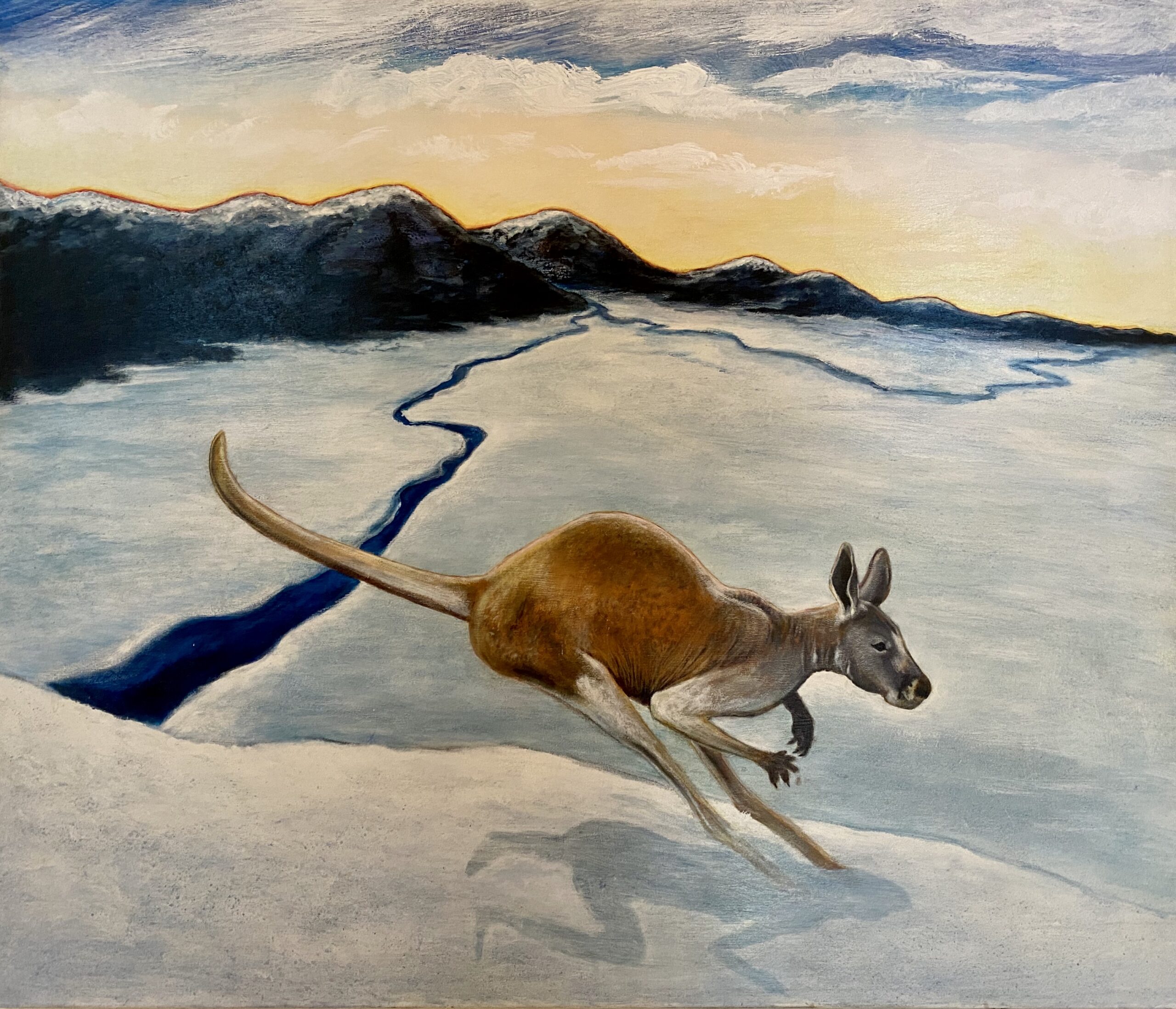
Subject Matter: A lone kangaroo leaps through a vast, snowy, desolate landscape as the sun sets or rises behind snow-capped mountains.
Form: Representational. The artist wants the viewer to perceive this painting as realistic and its story as believable, at least at first.
Visual Elements
- Line: Lots of curvilinear lines are seen in this work: the outline of the kangaroo’s body, the ledge upon which the kangaroo hops, the meandering streams, the transition from the vast plain to the mountains, the rounded mountain tops, and the clouds. There are no vertical or horizontal lines anywhere. This is not presented from the perspective of logic and the intellect. It is geared more toward the instincts and emotions.
There are some important diagonal lines as well, suggesting a sense of movement and instability. They are seen in the kangaroo’s pose, the slant of the ledge, and the stream closest to the viewer. It’s also possible to see the stream as a jagged diagonal, projecting a hint of danger or greater instability onto the scene.
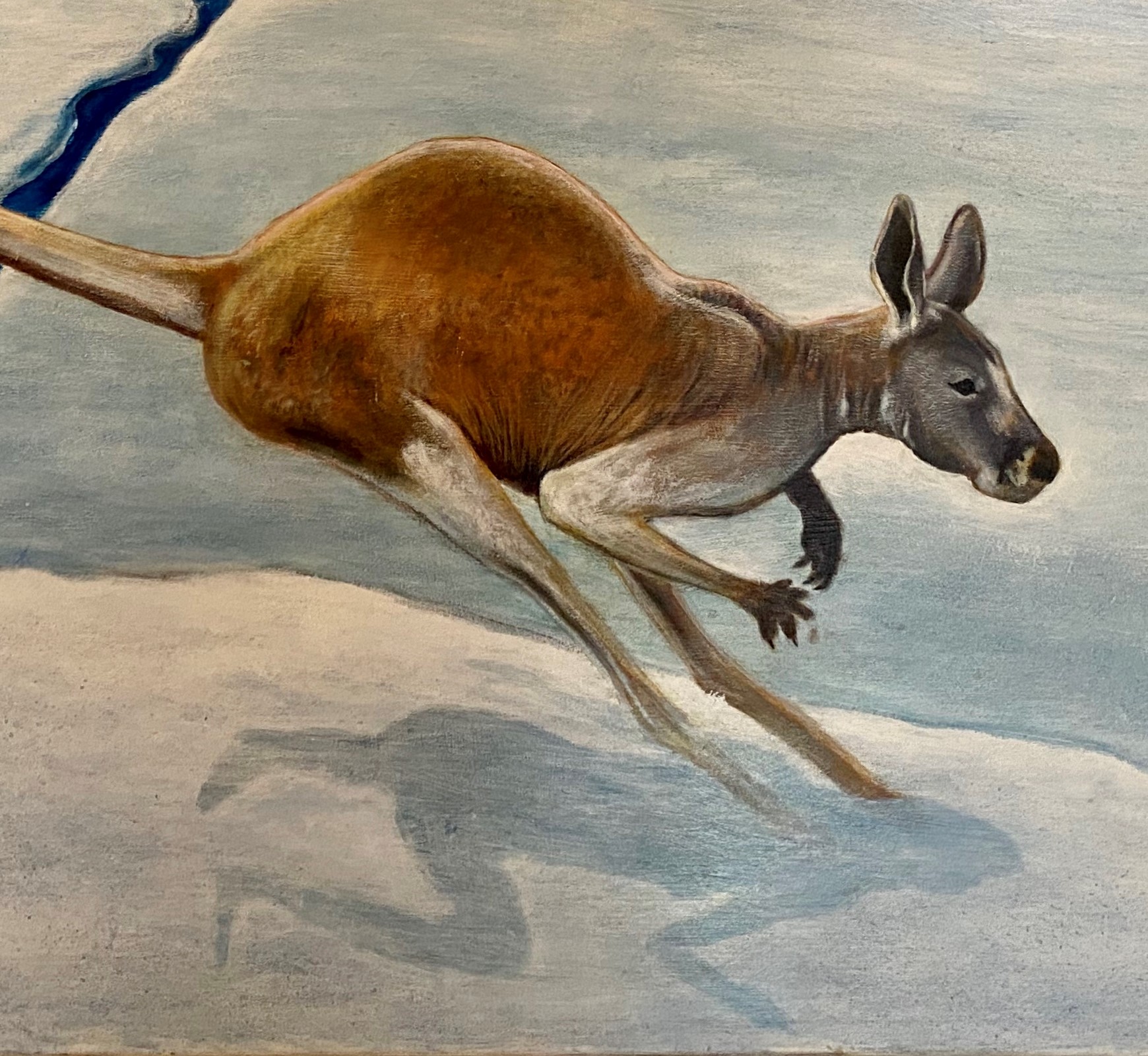
The line character is consistently light, thin, and mostly smooth, contributing to an overall feeling of natural gentleness. - Shape: The shapes are all organic and speak to our primal instincts and emotions. This work is about all things natural. There is no sign of anything manmade.
- Depth: There’s a wonderful sense of depth in this painting as most of the space-creating devices (except linear and atmospheric perspective) are used. We perceive the kangaroo as closest to us because of its large size, its placement low on the picture plane, its warm color advancing toward our eye, and how it overlaps the landscape.
The placement of the mountains higher up on the picture plane makes them appear farther away, and their diminishing size from the left of the painting to the right makes them look like they’re receding into the distance.
Although we can’t see a horizon line, our eye level seems to be in the middle of the vast space. We can confirm our viewing position as slightly higher than the kangaroo because we can see the top of the animal’s back, neck, and head. Our middle ground eye level is also verified because we look down at the stream flowing lowest on the picture plane and up to the mountainsides placed high up in the image. We look directly out at the distant plain.
This vantage point offers an up-close-and-personal connection with the animal and an all-encompassing view of her environment, which was designed to appear as an extension of our space.
- Value: Chiaroscuro makes the kangaroo look softly rounded while minimal value contrast seen within the mountains, snowy land, and cloudy sky; adds a subtle unifying quality.
But there is also strong value contrast most strikingly seen between the mountains and the sky, the mountains and the snowy plain, and between the plain and the two streams. These sharp contrasts add punch to the scene and keep the painting from being too subtle and quiet. The one stream, especially, appears as a violent gash in the otherwise tranquil landscape. - Color: The colors are primarily cool, which enhances the calm, soothing quality of the painting. The monochromatic blue-grey of the snow throughout the vast plain has a subtle unifying effect on the work.
The orange-brown kangaroo, the red line running along the mountains, and the yellow in the sky are the only warm colors. Since warm colors advance toward the eye, they pop and add energy to the scene. The dark blue/purple mountains are complementary in color to the yellow sky, and the two side-by-side intensify each other. The contrast between the kangaroo’s warm-colored fur and the surrounding cool-colored snow makes the animal dramatically stand out. So, although the predominant mood of the work is calm and soothing, there is also an element of drama and intensity.
- Texture, Pattern, Movement, and Time: The most prominent implied texture in the painting is the kangaroo’s fur which looks invitingly soft, stimulating our primal sense of touch. Pattern does not seem to play a significant role in this work, and the only thing suggesting movement and the passage of time is the diagonal position of the kangaroo, appearing to be on its way out of the picture.
Principles of Design
- Focal Point(s): The primary focal point is the kangaroo because of its large size, its unique shape, its warm coloring, and because it’s the only thing in the image that isn’t landscape. The painting is all about this animal.
I’d say the secondary focal point is the mountain range. The streams lead our eyes to it. The range is also very large, spanning the entire width of the painting. The strong value contrast between the mountains and the sky and their complementary colors also make the mountains stand out. This underscores the important role nature plays in this painting. - Balance: The balance is asymmetrical. The kangaroo isn’t centered exactly in the middle of the image, and the mountains are much larger on the left side than on the right. The streams on each side of the kangaroo are also quite different. This lends an unpredictable quality to the scene.
- Scale: The large scale of the kangaroo makes it appear close to us and accentuates its importance in the scene.
- Proportion: Proportions seem normal to me, confirming we are meant to perceive this scene as realistic and believable.
- Unity: The color blue is repeated throughout the painting, as are the curvilinear lines. Both these visual elements help move the eye around the work from “like thing” to “like thing.” Proximity is at play here too. The kangaroo overlaps the landscape surrounding her. That landscape butts against the mountains, and the mountains touch the sky, making everything appear connected. Directional forces also unify the work. Our gaze is led through the painting by following the kangaroo’s tail up to the mountains, the mountain ridge down to the stream, the stream over to the other diagonal stream, that stream to the ledge, and the ledge back to the kangaroo. Everything in this painting seems linked to everything else.
- Variety: There are several variations of blue in this work, and the curvilinear lines differ by what they define—the mountains, the kangaroo, the streams. And, of course, the kangaroo itself offers the greatest variety in the scene. But, I would say there’s a stronger sense of unity than variety. This scene of nature appears very holistic to me, everything seems intimately interconnected.
Concluding Interpretation: This asymmetrical, representational scene with its curvilinear lines, organic shapes, and its focus on a large-scale kangaroo with soft fur you can almost touch, offers an unpredictable, primal, instinctual, and emotional story about an animal alone in the wild.
The predominance of smooth curvilinear lines, organic shapes, and cool colors gives this painting a soothing effect. The deep empty space viewed at eye level pulls us in and offers up solitude and silence, increasing the painting’s meditative effect.
But the complementary warm and cool color combinations, strong value contrasts, and the jagged diagonal line of the stream all suggest something else—an energy contradicting the calm—a tension.
There are also mysterious qualities to the piece.
- The sun is setting (rising?) behind the mountains and behind the kangaroo, which should make the animal appear more silhouetted (like the mountain range). But the kangaroo seems to be lit from some other inexplicable source, which reveals her in great detail and fully three-dimensional. This unnatural manipulation of light represents a curious departure from reality that serves to magically heighten the animal’s significance.
- Kangaroos are social animals. They live in groups of ten or more and are not found in snowy areas. So, although the scene looks realistic, what we know about kangaroos makes us question this painted reality. Why is the kangaroo alone? Is she running away from her natural habitat? Has she been threatened? Or has her environment changed so drastically that it now snows where it never did before, making it uninhabitable for kangaroos? Might she be the only one left in this cold, desolate world? Whatever the case, she is not where she belongs, and she’s trying to escape.
- But the biggest mystery in the painting is the shadow of the kangaroo which takes on the shape of a crouching woman. Why? The artist took great pains to present us with a believable scene of nature, then he sabotaged it. What does that mean? It certainly jars us from reality. While the other subversive tweaks to nature hint that all is not what it seems, the shadow cinches it. Perhaps the whole purpose for these peculiarities is to simply shake up our conscious minds, force us out of our everyday complacency. Or is there more to it than that?
Does the shadow represent encroaching humanity that the kangaroo is trying to elude but can’t? Is it an invitation to project our own primal selves into the animal’s predicament? Or is it something else entirely? What do you think? How do you interpret this painting?
Thank you for joining me in this series on The Art of Visual Listening. I hope it has helped you to “see” art more fully and to “listen” to what it has to say more intently. And I hope you’ll be inspired to use what you’ve discovered in this series as an aid to appreciating, understanding, and evaluating works of art in the future.

Happy Listening!
 Buy Now!


Leave a Reply