
The Art of Visual Listening 10: The Wonderful World of Color
(Posted on Monday, June 29, 2020)
Of all the visual elements, color is the most complex and the most powerful. Whether it’s nature or art, color is often the first thing we notice. When we’re outside on a sunny spring day, we delight in how blue the sky is, how the new leaves are a bright yellow-green, and how intense the cranberry-colored bougainvillea blooms are.
But color does much more than just enhance our enjoyment of our surroundings. It also directly impacts our health and behavior. Premature babies with severe jaundice are put under blue lights to help them recover. Aggressive detainees are put in pink rooms to calm them down. And color even impacts our blood pressure. Red and yellow increase blood pressure while blue decreases it. (source: UK Essays).
Color also speaks to our emotions, intellect, and imagination. And according to color researchers, 85% of us make buying decisions primarily because of color with 90% of those decisions based exclusively on color. (Source: Color Psychology in Marketing)
Because color is such a powerful, multidimensional visual element, learning its complexities does require some effort. But stick with me on this, and I think you’ll find the journey into the wonderful world of color well worth it.
The Color Wheel and the Three Basic Color Categories
The best way to begin a discussion of color is with the color wheel—a convenient system for organizing and understanding the relationships between colors.
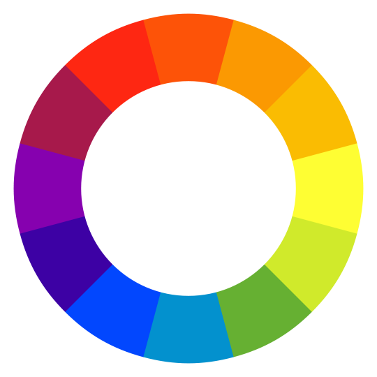
Primary colors are the three colors from which all the other colors are made.
But not all primary colors are the same. In the realm of light (like photography and computer displays), the primary colors are red, green, and blue. But when it comes to pigment (as with paintings), the primary colors are red, yellow, and blue.
For our purposes here, we’ll discuss color from the perspective of pigment, not light.
Secondary colors are created by combining two primaries. In the case of pigment, mixing red and yellow makes the secondary color of orange. Blue and yellow make green. Blue and red make purple.
Tertiary colors are made by blending a primary with the secondary next to it on the color wheel, creating colors like yellow-orange or blue-green.
Although the basic categories above offer a jumping-off point for our discussion of color, we need to delve deeper to discover how these colors impact us.
The Communicating Properties of Color
(Note: As mentioned before, the “rules” presented in this blog are not absolutes. The following information is a guide to understanding the communicating possibilities of color so we can better interpret what artists are telling us with their color choices, and we can better evaluate their mastery of art.)
Cool colors are blues, greens, and purples. We call these colors cool because they remind us of cool things in nature like water and ice and leafy shade.

Cool colors have the shortest wavelengths on the visual light spectrum, which make them appear to withdraw timidly from our eyes. Remember atmospheric perspective in our earlier discussion of depth? Mountains in the distance often look blue or purple—an important visual clue to how far away they are.

Cool colors are also calming and, as noted above, blue can lower blood pressure. At times, we even associate the color blue with melancholy, as in the saying, “I’m feeling blue.”
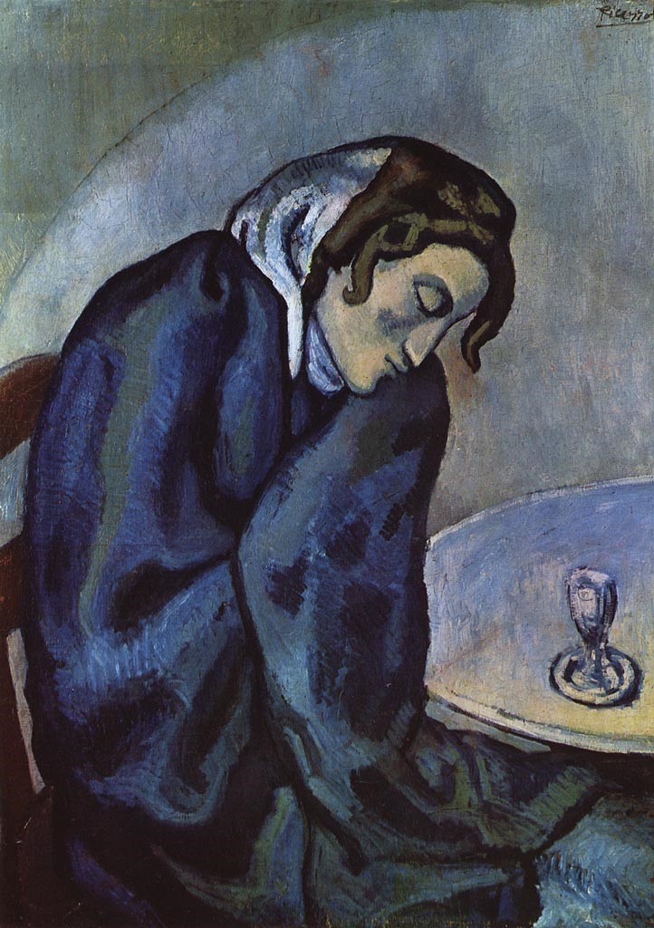
Some of Picasso’s early works provide good examples of how blue can communicate sadness. When Picasso went from Barcelona to Paris at the young age of 19, he was broke, had no work, and was living in a freezing apartment. These first few years in Paris are known as Picasso’s Blue Period because his canvases from that time (like the ones below) were painted almost entirely in blues, and his subjects were primarily lonely depressed people.
[Public Domain]
So, to recap: We associate cool colors with cool temperatures, distance, calm feelings, and (depending on the painting) even melancholy.
Warm colors are reds, yellows, and oranges. We call these colors warm because we associate them with warm things in nature, like fire and the sun.
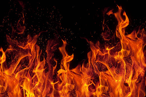
Physiologically, warm colors are arousing. They can increase blood pressure and breathing rates. And, like cool colors, they’re associated with mood. When we say, “he saw red,” we mean, “he was angry.”
Warm colors communicate intensity and high energy partially because they have the longest wavelengths on the light spectrum, which make them appear to move aggressively toward us.
There’s no question that the warm colors dominating the work below add to its disturbing intensity.
But when you see the same print in the cool color of blue, the image seems less intense and more melancholy.
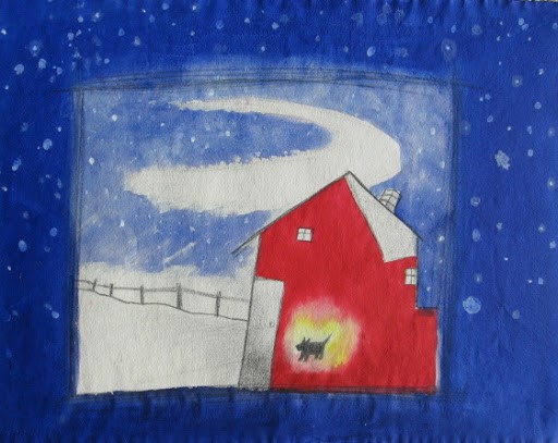
Warm and cool color combinations also tend to communicate energy because they contrast so starkly with each other—the warm jumping forward and the cool pulling back.
While the blue background of the work below communicates a soothing peacefulness, the red house and yellow aura of the dog leap out at us, adding a curious energy to the quiet chill of the snowy scene.
Arbitrary colors have nothing to do with the colors of nature. So when artists use them, we know they’re not interested in duplicating reality. They’re interested in something else—perhaps communicating emotions, creating a fantasy world, or exploring color and composition solely for themselves.
Arbitrary colors became popular at the end of the 19th century. Since photography had been invented by then, artists felt free to move away from “photographic” representation and to be more interpretive and imaginative with their works.
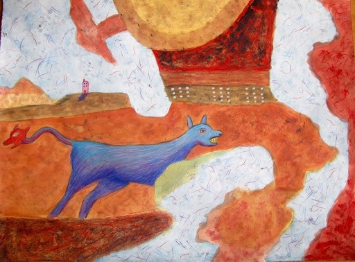
The blue animal in the image below is a good example of the use of arbitrary color. This is a fantasy image meant to stir your imagination. The colors underscore that interpretation. (See the red head on the tip of the dog’s tail?)
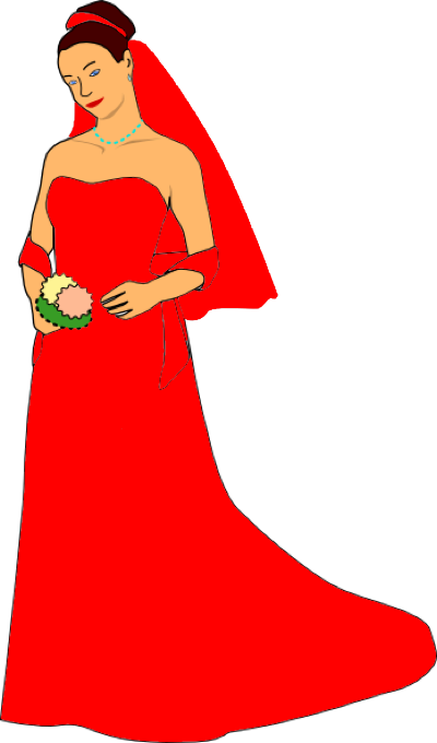
Symbolic colors are usually cultural. For example, in the United States, brides traditionally wear white at their weddings because we see white as a symbol of purity.
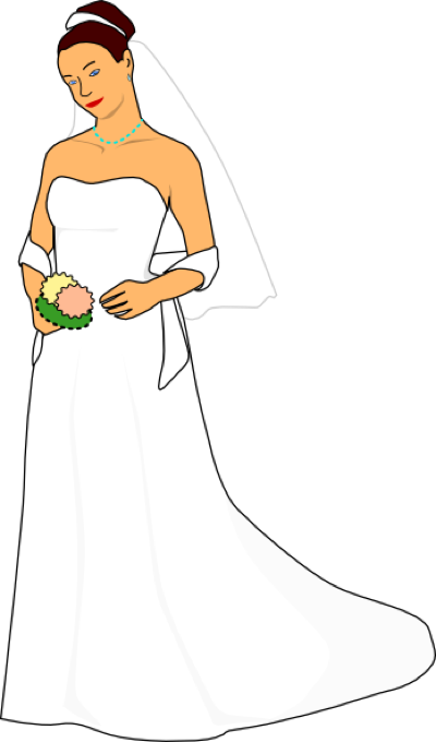
But imagine being at a wedding and seeing the bride walk down the aisle in a bright red dress. What does that tell us? Well, for one thing, It’s clear the bride has no interest in tradition, but what does her color choice suggest symbolically? Certainly not purity.
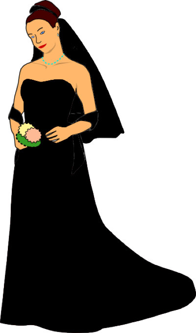
Imagine the same scenario again, but now the bride is wearing black. She’s obviously not interested in tradition either. In this case, though, we might think she’s not happy about getting married at all. She’s dressed for a funeral.
Symbolic color can also be personal. The works of Franz Marc are a good example of this. In a letter written in 1910, he explained his unique take on color. “Blue is the masculine principle, astringent and spiritual. Yellow the female principle, gentle, gay and sensuous. Red is matter, brutal and heavy and always the colour that the other two must oppose and overcome!” Knowing this about Marc’s colors helps us to appreciate his work on a deeper level.

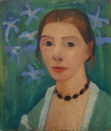
Analogous colors are those located next to each other on the color wheel and are very similar, like purple, blue, and green. All of these colors have blue in them. Analogous color schemes communicate a subtle and unifying feeling.
Notice how the calm sitter in the painting below (the artist herself) unites with the background through the use of cool analogous colors.
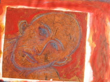
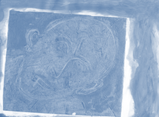
Monochromatic color schemes occur when an artist uses only one color throughout the entire painting. Like analogous color schemes, monochromatic color combinations are subtle and unifying.
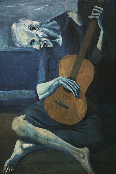
Roger Mendes’ untitled image of a man’s head (below) is a good example of how unifying a monochromatic color scheme can be for both the composition and the message.
(Note: Black, white, brown, and gray are not true colors. When they are used in a painting along with variations of one true color, the work is still considered monochromatic.)
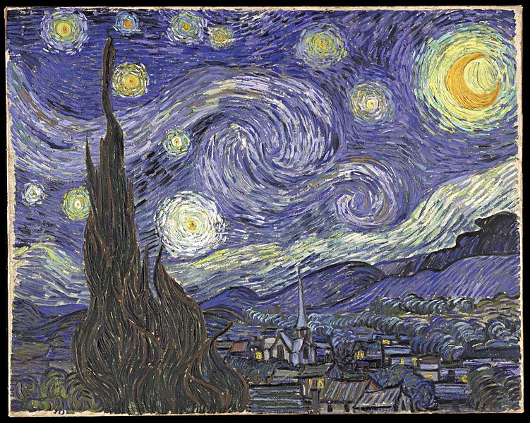
Complementary colors are opposite each other on the color wheel. They have nothing in common. When they’re side-by-side, each color appears more intense than by itself. This is because of the visual phenomenon called simultaneous contrast in which a color tends to reflect its complement into an adjacent color.
The basic complementary color pairs are: red and green, blue and orange, yellow and purple. If purple and yellow are placed together in a painting, for example, the purple reflects its complement (yellow) into the yellow, and the yellow reflects its complement (purple) into the purple, giving us a double-dose of each color.
I’m sure you’re familiar with the famous van Gogh painting below. But now that you know something about simultaneous contrast, you can understand how the juxtaposition of complementary colors contributes to the cosmic intensity of this painting.
Now let’s take another look at Franz Marc’s The Blue Horse. Notice how he surrounds his calm horse with the intense juxtapositions of purple next to yellow and red next to green. These complementary colors give the painting palpable energy. The horse may be calm, but the world around him is not.
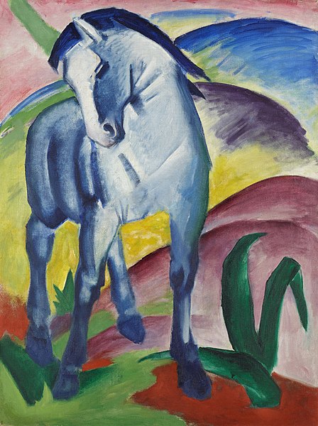
It’s worth noting that Franz Marc was a German Expressionist painter, and he created The Blue Horse in 1911, three years before the start of World War I. At the age of 36, Franz Marc was killed in that war.
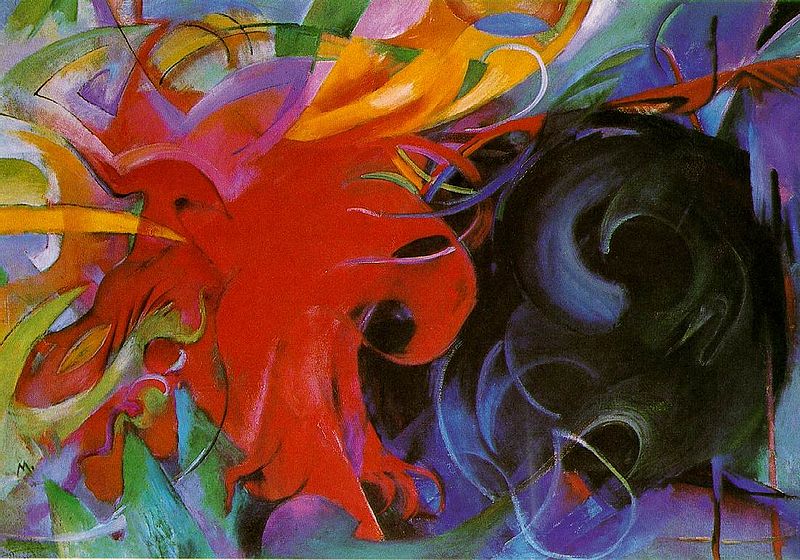
Marc painted his last work in 1914 at the war’s outbreak. It’s called Fighting Forms and speaks for itself.
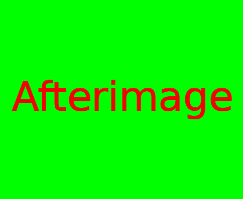
Before we leave the subject of complementary colors, you might also be interested in another optical trick these colors play. It’s called an afterimage. Stare at the image below for 20–60 seconds and then look at something white or close your eyes and tilt your head up. You should see a red/pink (magenta) square appear—the complement of the green square.
The American contemporary artist Jasper Johns used this optical illusion in the work below. After staring at the white dot in the center of the upper flag, look at the black dot in the lower flag to see the after image. (If the illusion doesn’t work for you here, click on the link under the image to view a larger representation.)
Johns was fascinated with how we see things, and Flags was one of his many explorations into the nature of perception.
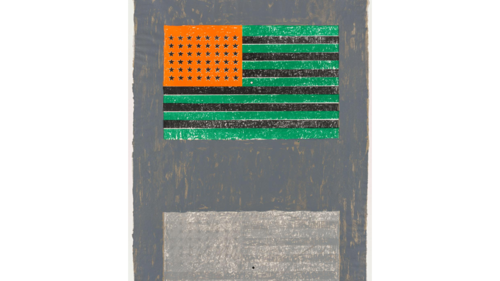
https://www.clevelandart.org/art/1979.125
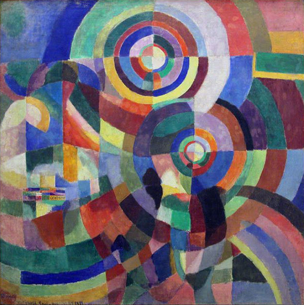
Polychromatic color schemes happen when an artist uses more than three colors throughout the entire painting. Because there are so many colors in play, polychromatic color schemes communicate high energy.
To see this energy in action, let’s take a second look at Sonia Delaunay’s painting first seen at the top of this page. It’s called Electric Prisms. Isn’t that the perfect title for this piece?

For another sampling of the polychromatic color scheme at its raucous best, check out the painting below by Paul Signac. Again, note the appropriateness of the title. It’s as colorful as the painting.
| Signac painted in a style termed Neo-Impressionism where artists, inspired by the latest developments in color theory, applied tiny dots and dabs of pure unmixed colors to their paintings. This way, the pure colors would mix in the viewer’s eye (not on the canvas) and retain their original luminosity. |
Conclusion
Before we go on to the last combination of visual elements—texture, pattern, movement, and time—let’s pause for a moment to pull all this information about color together and analyze a painting by Raphael.
Along with Leonardo da Vinci, Michelangelo, Titian, and Giorgione, Raphael is considered to be one of the outstanding artists of the Italian High Renaissance.
Exercise: Using the information from this post, what do the colors communicate in Raphael’s masterpiece below?
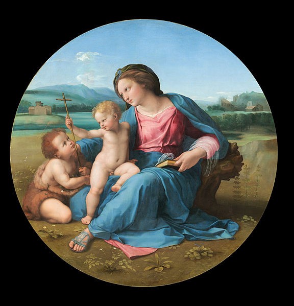
Want to understand even more why this work is called a masterpiece? Just take another minute or so to analyze the painting again. But this time, look at it from the perspective of the other visual elements we’ve discussed ( line, shape, depth, and value). After doing this, you’ll be able to see how well the elements combine to create a powerful, layered message that beautifully enriches the Christian subject: Jesus, his mother, and St. John the Baptist.
After you’ve done your own analysis, click the link below to see my interpretation if you like.
Okay, ready to move on? The visual elements of texture, pattern, movement, and time are up next.
For more information
Want to learn more about Sonia Delaunay? Go to: https://www.tate.org.uk/whats-on/tate-modern/exhibition/ey-exhibition-sonia-delaunay/delaunay-introduction
If you’d like to read more about simultaneous contrasts, go to: http://www.webexhibits.org/colorart/contrast.html.
If you’d like to experiment with seeing other afterimages check out this website: https://www.animations.physics.unsw.edu.au/jw/light/complementary-colours.htm
Curious about Pablo Picasso’s Blue Period? Go to: https://www.pablopicasso.org/blue-period.jsp
Want to learn more about Franz Marc? Go to: https://www.franzmarc.org/
Can’t get enough of van Gogh? Go to: https://www.vangoghgallery.com/
Need more information on Jasper Johns? Go to: https://www.metmuseum.org/toah/hd/john/hd_john.htm
Never heard of Paula Modersohn-Becker? Here ya go: https://www.moma.org/artists/4037
For more about Paul Signac and Neo-Impressionism go to: https://en.wikipedia.org/wiki/Neo-Impressionism
There’s always more to know about Raphael. https://www.raphaelsanzio.org/
 Buy Now!


Email Sign-Up
Enter your email address to join the mailing list.
Leave a Reply