
The Art of Visual Listening 11: Texture, Pattern, Movement, and Time
(Posted on Monday, March 15, 2021)
Texture, pattern, movement, and time are the last of the visual elements, but certainly not the least. As with the other elements we’ve discussed, their importance in any given work of art has everything to do with what the artist wants to say.
Texture
Texture refers to the surface quality of objects and directly appeals to our sense of touch—the first sense we developed as humans, and so, our most primal sense. Texture can speak to us on levels we don’t even know we have.
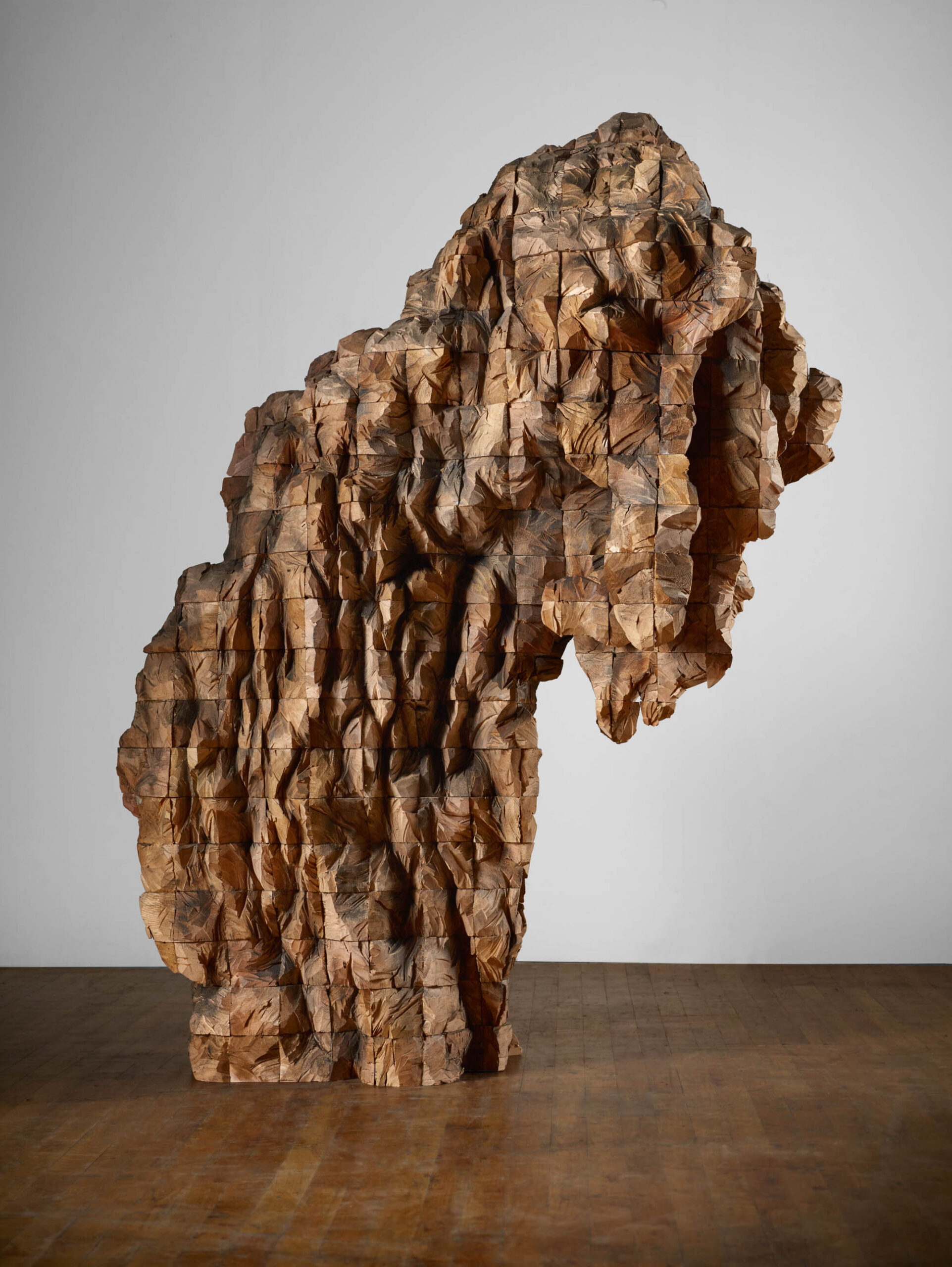
Take a look at the sculpture above by Ursula von Rydingsvard. Notice how the work is all about texture. When asked where she got her vision for her art, she said, “Whatever is churning in the deepest part of me, that comes out.”
There are two general categories for texture: actual and implied.
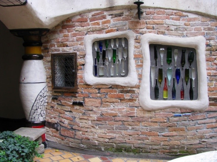
- Actual texture is what the real surface of an object feels like when you touch it. If you touched either the building shown below or the sculpture above, you would feel the unevenness. Rough textures like these feel raw and unrefined to the touch, so they tend to communicate the same things to the viewer—a visceral earthiness.
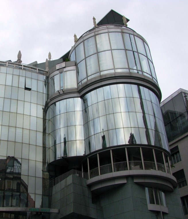
Actual texture that’s smooth (whether hard or soft) feels more refined. If you compare Kunst Haus Wien above with Hass Haus below (both in Vienna) you can see how the different textures communicate different interests. One celebrates the raw, uneven qualities of nature (primal and rough), while the other extolls the refining efforts of humans (polished, tamed, and slick).
- Impasto: When it comes to real three-dimensional texture in art, we normally think of architecture and sculpture. But there’s another type of actual texture used in paintings, and it’s called impasto. Impasto refers to paint applied so thickly that it creates its own 3-D surface, revealing the artist’s brushstrokes. This technique brings the process of creation to the foreground and in so doing, offers a more intimate connection with the artist.
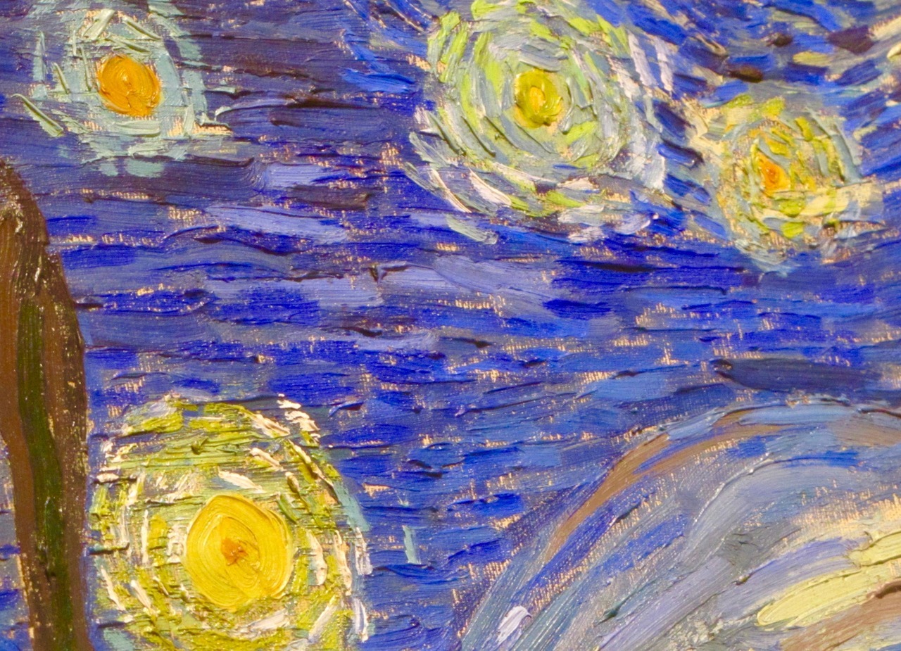
Vincent Van Gogh frequently used impasto. In the detail below from his famous painting, Starry Night, (previously discussed in our post on color) we can see exactly how he applied the paint. By following the artist’s process in this way, we’re more aware of his involvement in the work, which can make us feel more emotionally connected to him. This painting says a great deal about the intense energy of the artist.
Impasto, then, can be used to help the artist express something personal and passionate beyond the subject matter itself.
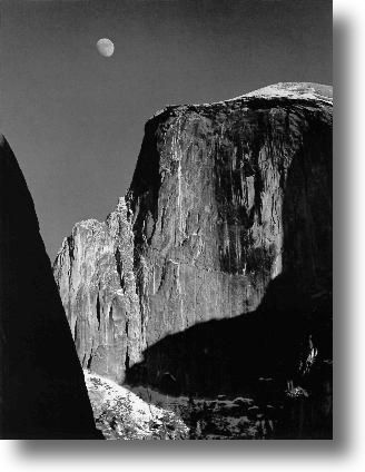
Implied texture is Illusionistic. Photographs rely on this kind of texture. It you touch the photographic surface, it’s smooth, but the object portrayed in the photo could be craggy and rough like in the work below by Ansel Adams.
Implied textures communicate the same way actual textures do. Some artists are so good at implying textures in paintings; it’s hard to believe they aren’t real. We call that trompe l’oeil (or trick the eye in French). The Irish-American artist, William Harnett, was a master at trompe l’oeil.
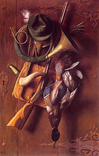
Whenever I see his works, they always astound me. No matter how hard, or for how long, or from what angle I look at them, they still appear three-dimensional. Those simulated textures never look like the flat smooth paint they actually are. The feathers remain feathers to my eyes, the wood remains wood, and the brass remains brass.
Pattern
Pattern exists in art when elements are repeated to create regular arrangements. The human brain is particularly adept at pattern recognition which makes it a powerful element for engaging the viewer.
Pattern is also related to texture. One of the ways we can remember the feel of certain textures is by the distinct patterns they make.
Oftentimes, the purpose of pattern in art is decorative—to beautify the surface of an object. The page below from the Book of Durrow (a medieval illuminated manuscript probably created in Ireland or England around 700 AD) is an excellent example of the decorative quality of pattern.
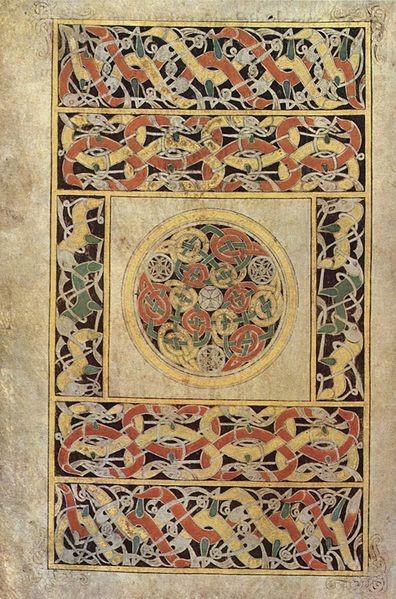
Because pattern is created by repetition, it also helps to unify a piece, to give it a sense of cohesiveness. Similar things appear to belong together, and our eye connects them. (We’ll talk more about repetition and unity in an upcoming post.)
So, pattern can be decorative and unifying. It can appeal to our sense of touch. But it can also help to communicate movement and time.
Movement and Time
Look again at those repeated snake-like shapes and lines in the Book of Durrow above. Don’t they appear to be squirming all over the page? The movement of your gaze from one similar but slightly different undulating form to another makes them appear to be changing before your eyes and sets up a sense of continuous movement which also suggests the passage of time.
Now look at the image below. Do you get a feeling of movement and time in this work too? Why?
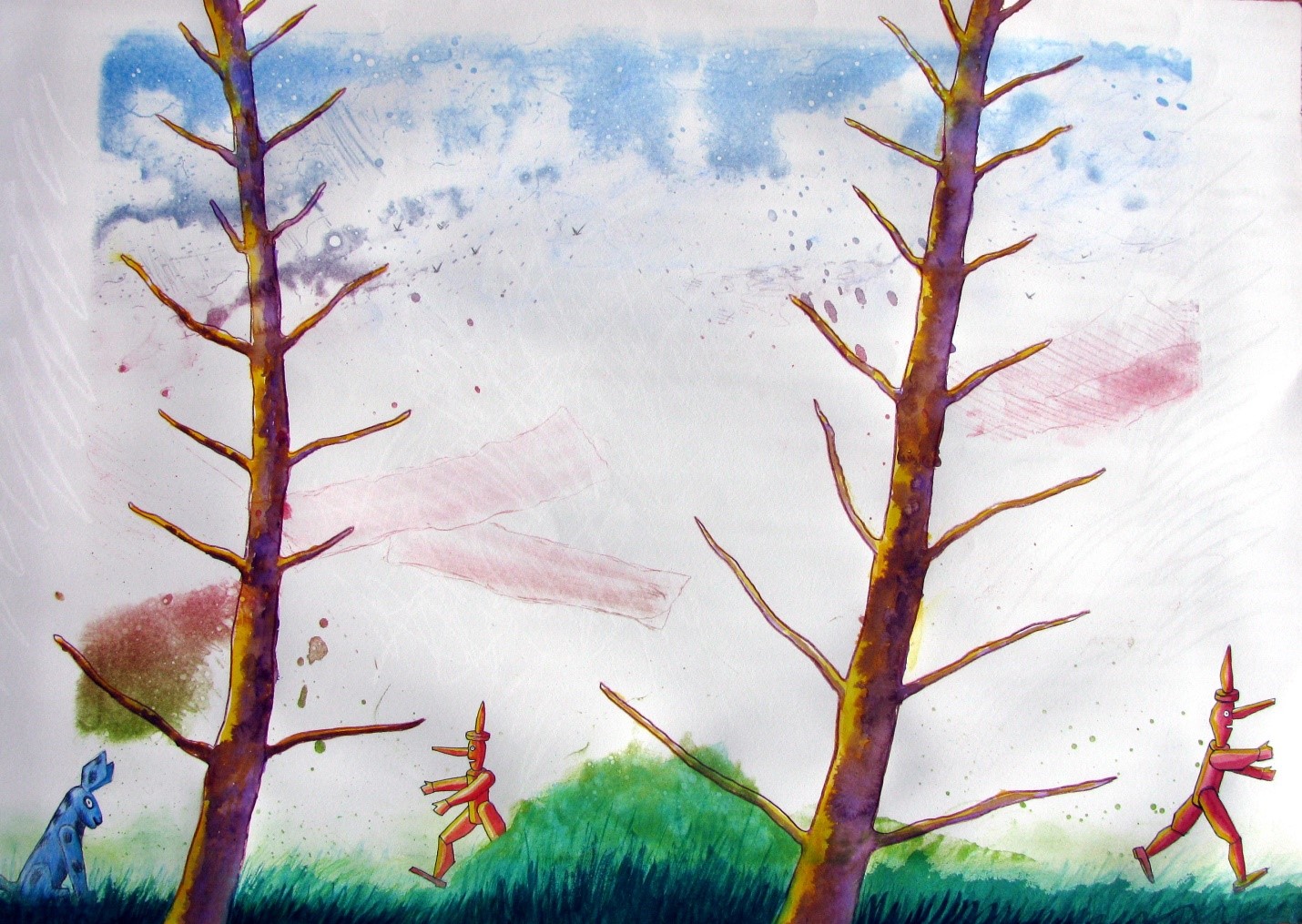
Along with the diagonal lines (as we discussed in an earlier post on line and shape), the pattern created by the repetition of the wooden Pinocchio and the tree gives us a sense of movement. Facing one way and then the other, the repeated figure suggests both movement and the time it takes to run back and forth, exactly what the artist wants us to sense (as the title tells us). With movement and time implicit in this piece, it’s easy to imagine a whole time-consuming and motion-filled story unfolding before our eyes within this one static image. It’s a fun and effective way to keep us engaged in the work.
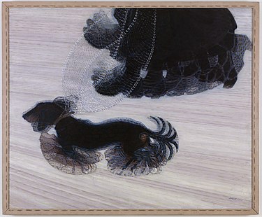
In the painting below by the twentieth-century futurist artist, Balla, we also see how the visual elements of movement and time enhance the artist’s message. Notice how well the blurred repetition communicates the energy and pace of the dog, its leash, and its human.
This concludes our discussion of the visual elements and how they can help us understand what an artist is trying to communicate and help us appreciate how well that communication is working.
But, as I’m sure you can imagine, there’s more to it than that. In order for the visual elements to communicate at their best, they must work together, and that’s where the principles of design come in. As with music, a single sound can communicate a powerful sensation for the listener, but one sound is limited. Multiple sounds when brought together skillfully can communicate much more. So, let’s move on to discover how artists can combine the individual visual elements into effective orchestral compositions.
 Buy Now!


Leave a Reply