
The Art of Visual Listening 9: The Value of Light
(Posted on Sunday, April 12, 2020)
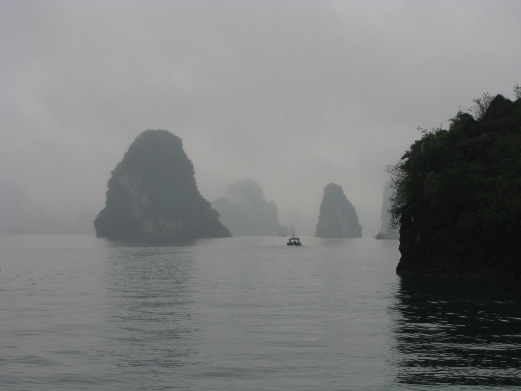
Halong Bay, Vietnam, photo by Roger Mendes (permission of the artist)
The visual element—value—refers to light and is defined as the relative lightness or darkness of what we see. Our vision relies on light and it’s variations of value. If there’s too much light and everything has the same high value, we say we’re blinded by the light. If there’s not enough light and everything has the same low value, we’re plunged into darkness. Either way, we cannot see. Our sight depends on differing values of light and so does art.
Whether an artist chooses representational, abstract, or non-representational imagery, s/he must know how to manipulate value.
Seeing Value:
Black and white photography probably did more than anything else to make us realize how important value is in comprehending our visual world.
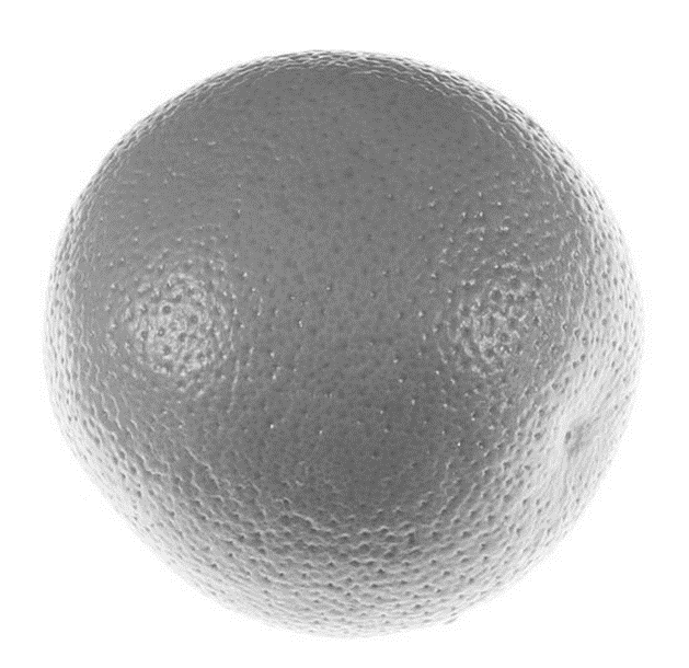
image by freestock.ca, via Wikimedia Commons
Even without color, we know the circular object above is an orange, and it’s the value plays that tell us that. They tell us the circle is not flat nor is it smooth. It has a rounded volume with a very specific texture. And that cinches the ID—orange.
As you can see, the circular shape gradually progresses in value from light to dark and back again, making the object look spherical. The circle is also covered with dots that are only visible because they differ in value from the values around them. The dots give the sphere an overall pitted appearance, a texture we recognize as belonging to an orange.
Okay, you say, kudos to photography for making value plays so clear, but why is that important in art?
It’s important because it’s vital to our visual understanding of the world around us, and, as always, that’s our gateway to understanding and evaluating art. Without value plays, the object above there would look like a flat circle and nothing more. Being sensitive to value allows artists to define dimensions, reveal subtleties, and express drama in their works.
Look at the orange in the painting below.
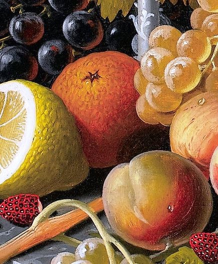
Severin Roesen – Still Life with Fruit and a Bird’s Nest (detail) (circa 1815-1872) [Public domain], via Wikimedia Commons
Now imagine that orange depicted like this.
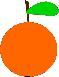
clker.com clipart
You would probably still be able to identify it as an orange, but it would look totally out of place in the painting. And it would defeat the goal of this piece, to replicate the luscious plumpness and enticing textures of these fruits. To make you want to touch and eat them. To make you hungry.
So, how an artist chooses to use value helps us understand what that artist is trying to convey which also helps us to evaluate how well s/he does it.
What Value Manipulation Can Tell Us:
When it comes to value, there are a variety of techniques artists use and each one has its own communicating qualities.
Chiaroscuro imitates the gradual transition from light to dark that we notice on rounded objects under natural lighting as we saw with our black and white orange above. When done well, chiaroscuro can transform a flat shape on a flat surface into what appears to be a curved form with weight, volume, and texture.
Leonardo da Vinci was a master at this technique. Look at the detail below of Leonard’s Mona Lisa. How soft, almost boneless, her hands look. Young and pampered.
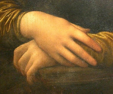
Leonardo da Vinci, Mona Lisa (detail), via Wikimedia Commons
[Public Domain]
It’s Leonardo’s skill with chiaroscuro that communicates this gentle naturalism to the viewer.
Tenebrism is also a technique for representing the transition from light to dark that we see on rounded objects. Tenebrism, though, imitates what we see under intense lighting conditions, like a spotlight. The light/dark transition is abrupt instead of gradual. Artists use this technique to make images look three-dimensional and weighty, but also to communicate drama. This is not the way the scene would look under natural daylight, but the way it would look under extreme lighting conditions. It’s the extremes of light and dark, the stark contrasts, that make the painting more dramatic.
Look at the two images below. Do you see the difference in techniques? Both figures are still and appear contemplative, but which one is more dramatic?
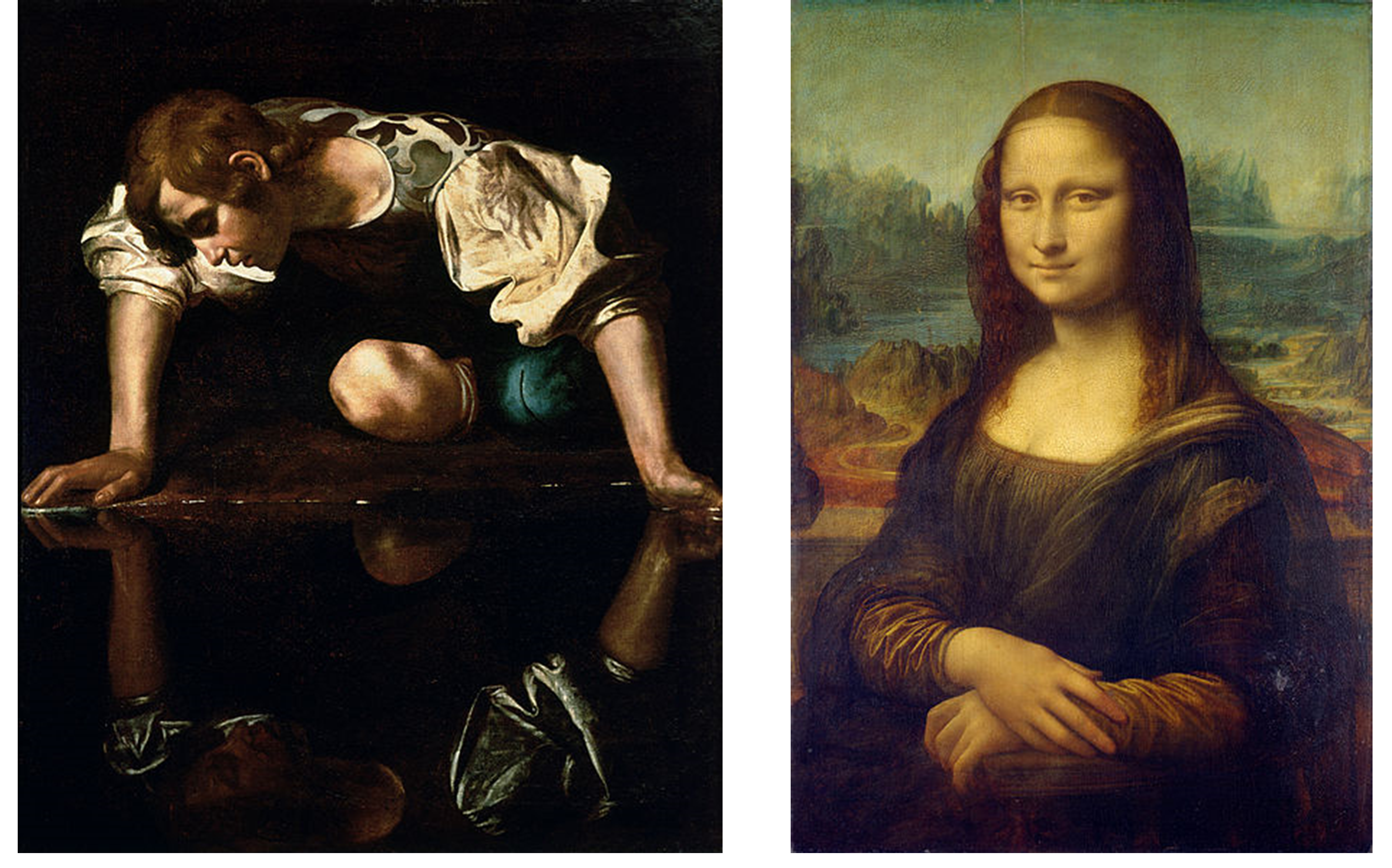
| Narcissus by Caravaggio [Public domain], via Wikimedia Commons |
Mona Lisa by Leonardo da Vinci [Public domain], via Wikimedia Commons |
There are other value plays, though, that have nothing to do with making individual objects, look round. These value plays don’t usually occur within a single object. Instead they’re found with shapes (or objects) located next to each other, like these below.
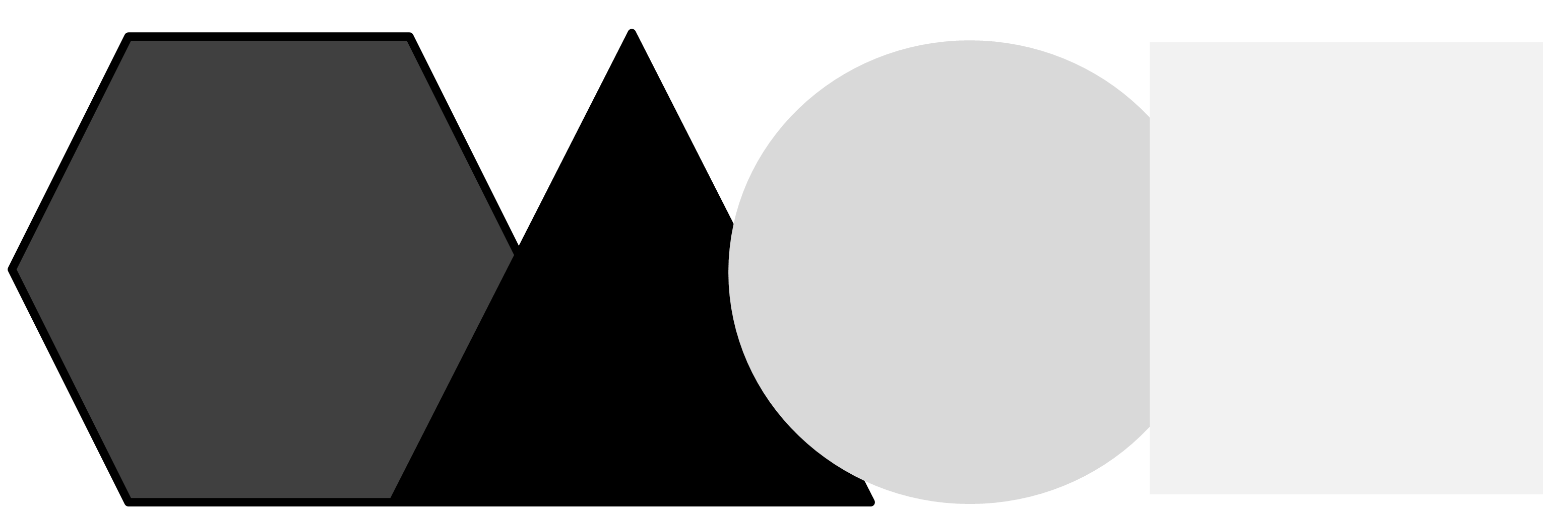
These value juxtapositions can communicate boldness or subtlety.
Strong value contrast: Light areas next to dark areas communicate a bold and dramatic message to the viewer the same way tenebrism does but without the three-dimensional element.

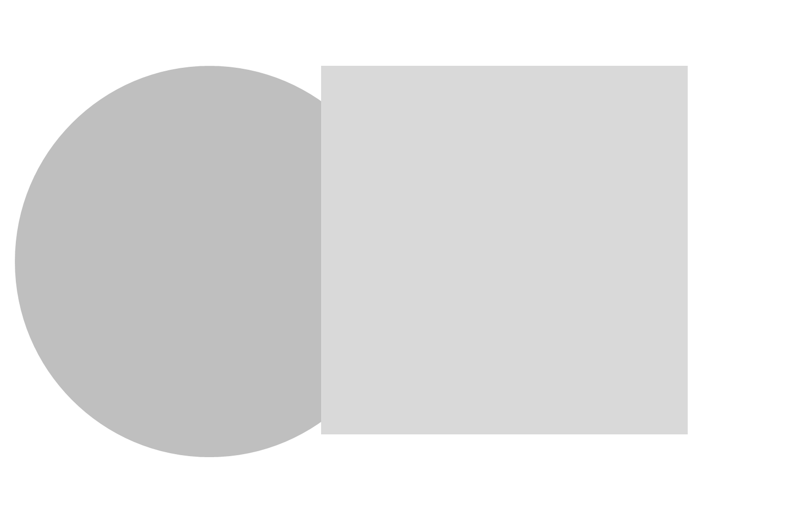
Minimal value contrast (high key): Light values next to light values communicate a subtle sense of unity.
Minimal value contrast (low key): Dark shapes next to dark shapes also communicate subtlety and unity.

So let’s see these value plays in action and how they help us appreciate the “value” of an artwork.
Below are two paintings by James McNeil Whistler. You probably know the one on the left as Whistler’s Mother, but the title Whistler gave it was Arrangement in Gray and Black. And the one on the right? He called it, Arrangement in Gray and Black no. 2. So, Whistler was clearly more interested in the play of values in these paintings than he was in his sitters.
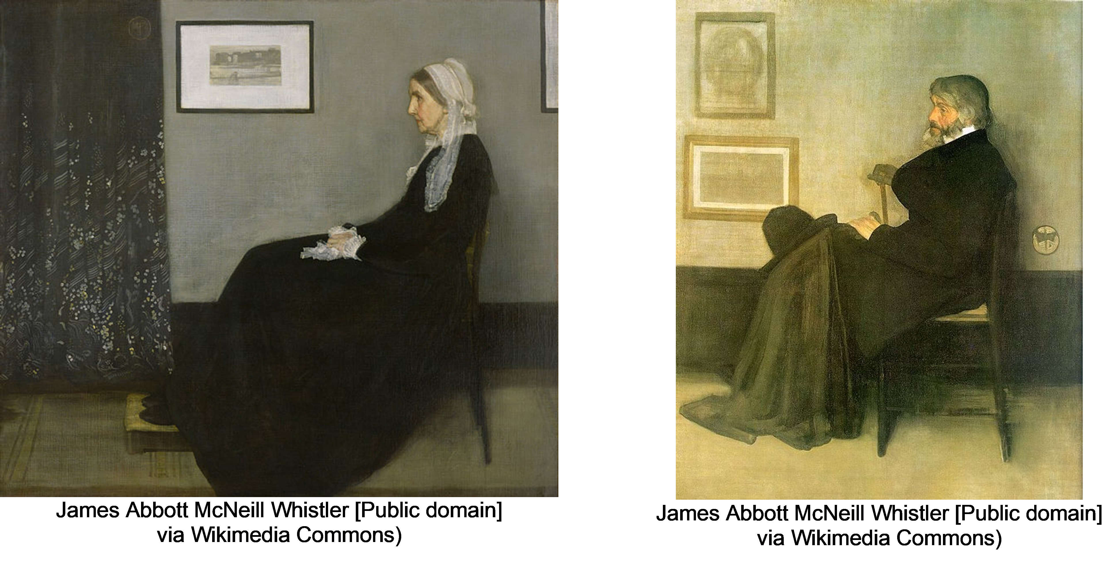
Knowing that, let’s look at these two works from Whistler’s perspective—for their variety of value plays. You might notice that except for the faces and hands (and the man’s cloak), the figures are pretty much flat. Chiaroscuro is used to make the faces, hands and cloak look 3-D, but those are the only places he uses it. The rest of the values in the paintings are strong and minimal value contrasts. In fact, they are value symphonies—dark on dark on dark, light on dark, light on light, dark on light on dark.
Both works were painted in the early 1870’s before Western artists had leaped into non-representational art and the appreciation of the visual elements for their own sakes. Art had to have a recognizable subject matter. But that was the farthest thing from Whistler’s mind.
In his book, The Gentle Art of Making Enemies, he wrote: “Take the picture of my mother, exhibited at the Royal Academy as an “Arrangement in Grey and Black.” Now that is what it is. To me it is interesting as a picture of my mother; but what can or ought the public do to care about the identity of the portrait?”
I think I can speak for many of us, that without the ability to appreciate value plays in and of themselves, these works would appear pretty dull. And their “value” as artworks might be lost on us.
Let’s look at another couple of paintings that require an understanding of value to fully appreciate: Monet’s Rouen Cathedral.
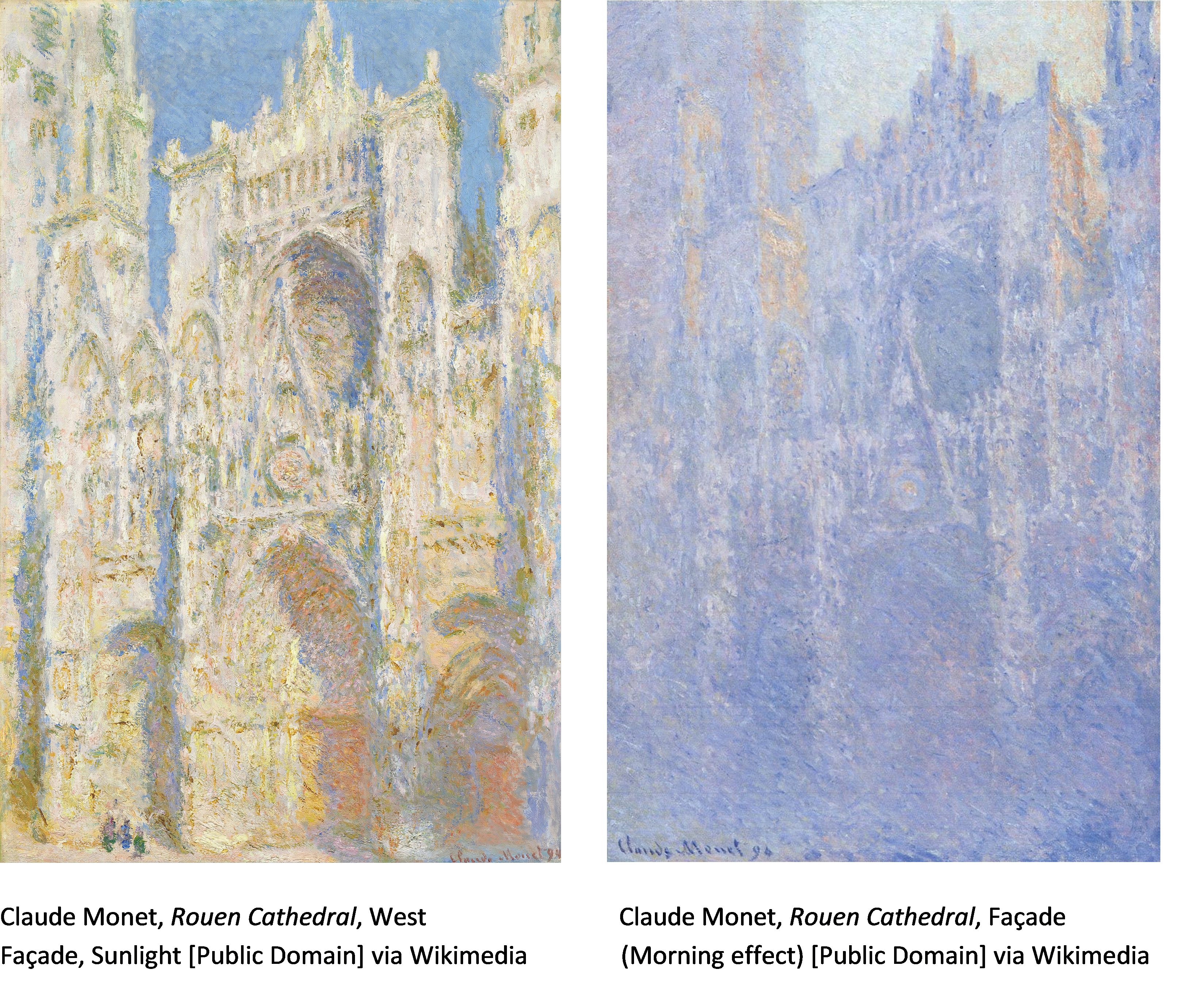
Between 1892 and 1894, Monet created thirty paintings of Rouen Cathedral from different times of the day and year. But it wasn’t the cathedral as much as the light that Monet wished to capture. The power of light to change the appearance of objects, to dissolve their solidity into a play of light and dark transitory colors. That’s what Monet wanted to capture.
And since color, like value, is all about light, Monet’s paintings provide a nice segue to our next topic: The Wonderful World of Color.
But before you go, look back at the photograph at the top of this post. Notice the different value plays and how they give this simple composition both a dramatic starkness and a sense of unity as the scene progresses into a mysterious depth.
And while you’re analyzing value, can you also identify the space-creating devices making this flat image look like a vista into space? If you need a refresher, check out my previous post on depth. If not, let’s move on to The Wonderful World of Color.
Image Credits
Halong Bay, Vietnam, 2016, Vietnam, by Roger Mendes
For more information on Roger Mendes, go to: http://www.rogermendesartist.com/artworks
Still Life with Fruit and a Bird’s Nest, circa 1815-1872, by Severin Roesen
For more information on Severin Roesen, go to: https://en.wikipedia.org/wiki/Severin_Roesen
Mona Lisa, 1503, by Leonardo da Vinci
For more information on Leonardo da Vinci, go to: https://www.leonardodavinci.net/
Narcissus, 1599, by Caravaggio
For more information on Caravaggio, go to: https://www.caravaggio.org/
Arrangement in Grey and Black, 1871 & Arrangement in Grey and Black, No. 2, 1873, by Whistler
For more information on Whistler, go to: https://www.jamesabbottmcneillwhistler.org/
Rouen Cathedral (series), 1892-1894, Monet
For more information on Monet, go to:
https://www.claude-monet.com/
 Buy Now!


Leave a Reply