
The Art of Visual Listening 12: The Principles of Design, Part I: Balance and Focal Point
(Posted on Saturday, March 20, 2021)
The principles of design are a basic set of rules for organizing works of art. Artists use these design principles to arrange the visual elements into compositions that have the potential to communicate most effectively. But, as with many rules, the principles of design are not set in cement. They’re more like general guidelines.
Rules . . . Again?
And while we’re on the topic of rules (again), now is perhaps a good time to address the issue of just how important these “rules” are to artists. It’s hard to imagine great creative geniuses sitting around and carefully plotting each brush stroke in order to conform to some rules. What usually happens is something much more intuitive. The rules are internalized, and some artists may not even be consciously aware of their existence. Artists are more likely to say, “I put red in that spot because that’s what it needed.” Or they might say, “My paintings have a life of their own. They tell me what to do next.” This sounds far removed from the idea of methodically applying a bunch of rules.
Well it is . . . and it isn’t . . . Have you ever listened to a good speaker and marveled at her smooth and articulate delivery? Is the speaker consciously following the rules of public speaking? Possibly not. But even without conscious awareness, she probably IS following the rules. That’s what makes the speech so good.
The same is true for artists. They don’t need to intentionally apply the rules to use them effectively. As art appreciators, though, paying attention to rules can help us analyze works of art which in turn helps us understand and appreciate what most artists are doing intuitively.
As the artist, Robert Motherwell once noted about making art, “It’s not that the creative act and the critical act are simultaneous. It’s more like you blurt something out and then analyze it.”
So, with that said, on with the rules!
A Balancing Act

Along with the communicating potential of the visual elements themselves, the way they’re arranged also impacts the way they communicate.
BALANCE: There are 3 basic possibilities for balancing a composition.
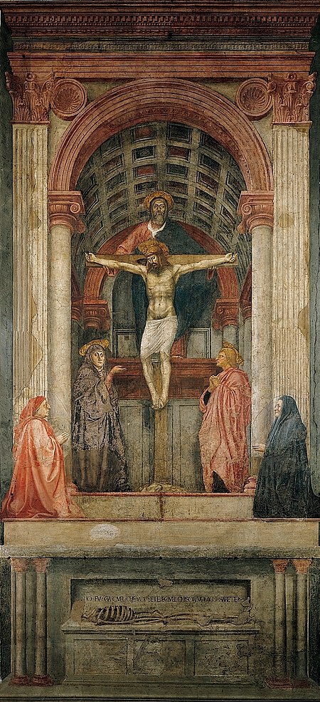
- Symmetrical balance is very predictable. If you were to draw a vertical line down the center of a symmetrically balanced artwork, the left and right sides would be identical (or nearly so). Because of this, there’re few surprises in symmetrical balance. It’s straightforward, reliable, and formal. The use of this type of balance in the religious painting below helps to underscore a message of unwavering dependability.
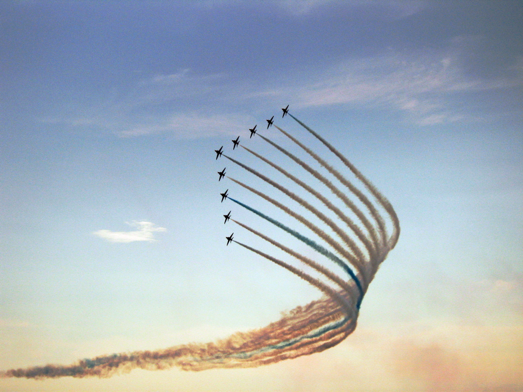
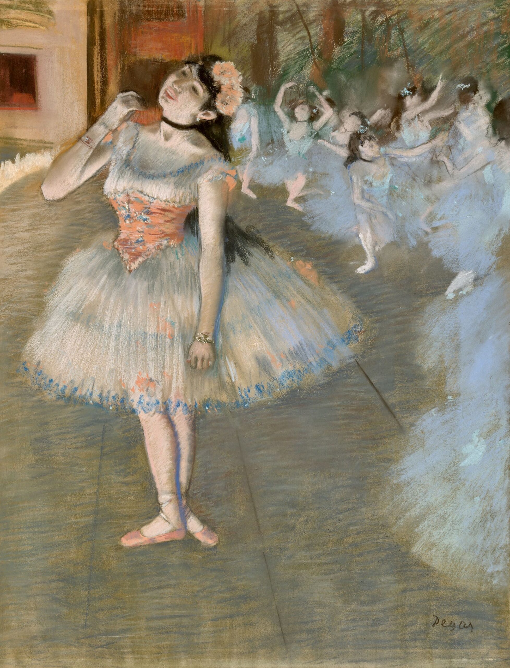
- Asymmetrical balance is informal and full of surprises. The left and right sides of the work are different but still visually balanced. Asymmetrical balance is more dynamic and spontaneous looking.
Notice in Degas’s painting below that the body of the single largescale ballerina takes up much of the left half of the painting while the right side is filled with several smaller-scale ballerinas. The asymmetrical balance helps to give a sense of immediacy, and impermanence to the scene.
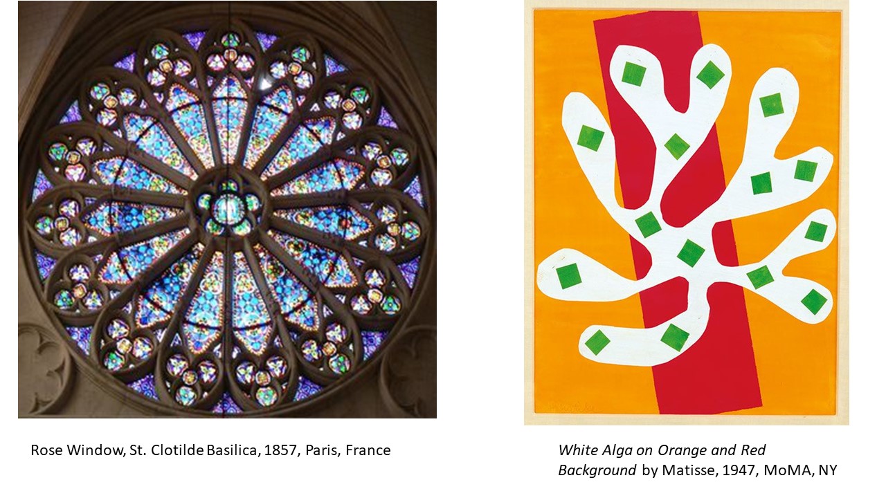
- Radial balance is composed of diagonals exploding in all directions which makes it dynamic. This dynamism can be formal like the rose window below on the left or more casually playful, as Matisse demonstrates with his cutout image on the right.
BALANCE RECAP: So, how an artist chooses to balance a composition contributes to the way it communicates, from static formality to spontaneous unpredictability to dynamic movement.
Keep Your Eyes on the Prize
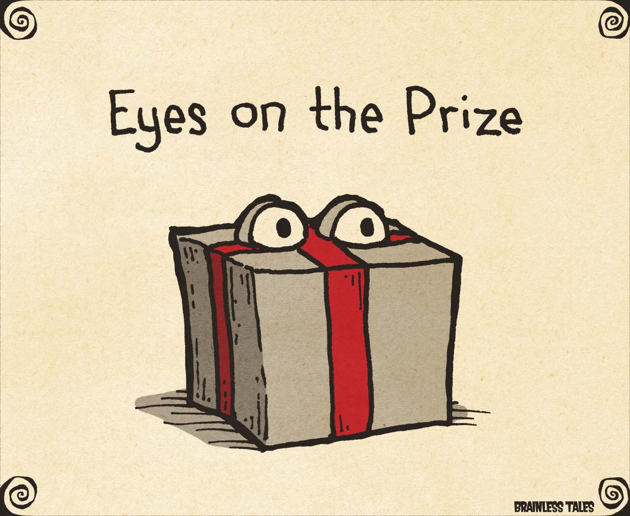
FOCAL POINT: Artists usually create focal points in their works to guide the viewer to what’s most important. Artists can draw your attention to the focal point(s) in a variety of ways.
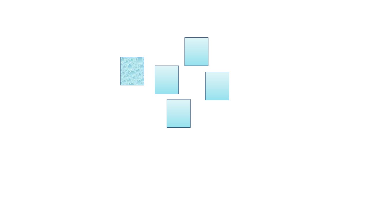
Contrast: One of those ways is to make an object different from its surroundings. This can be done by using one or more of the following:
- Color (like a warm color surrounded by cool colors )
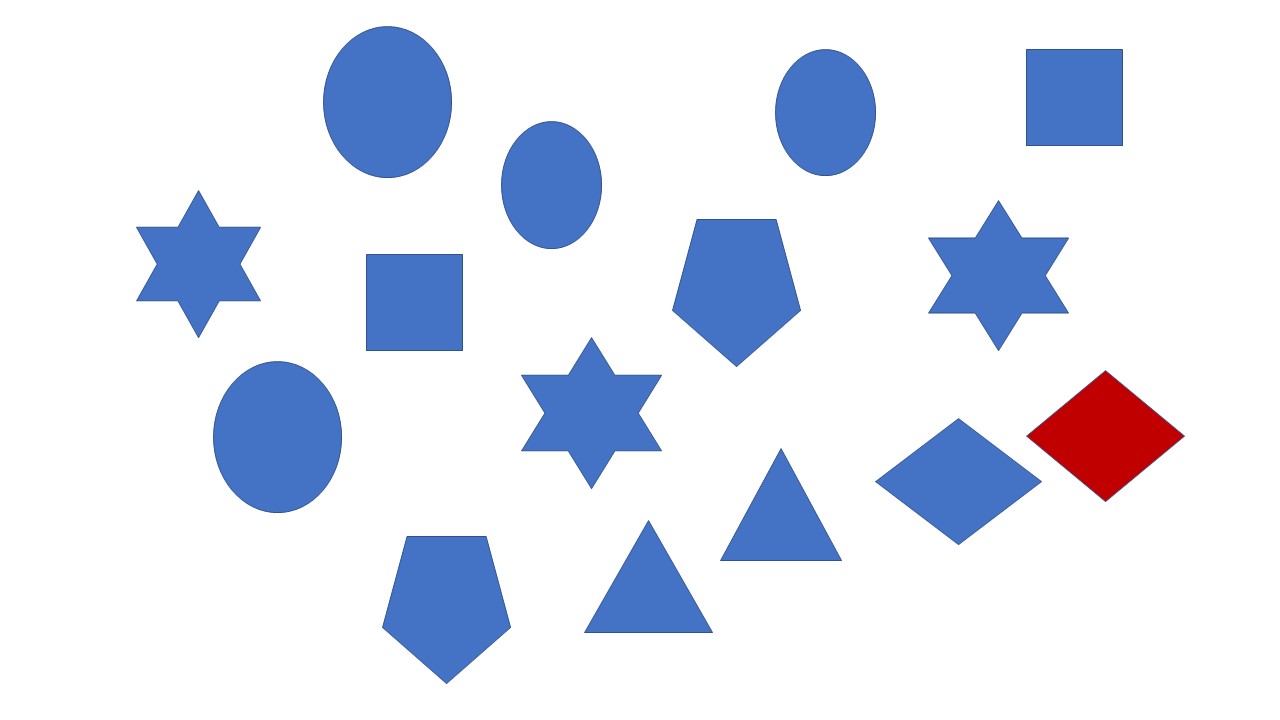
- Value (an object of light value placed among objects of a darker value for example)

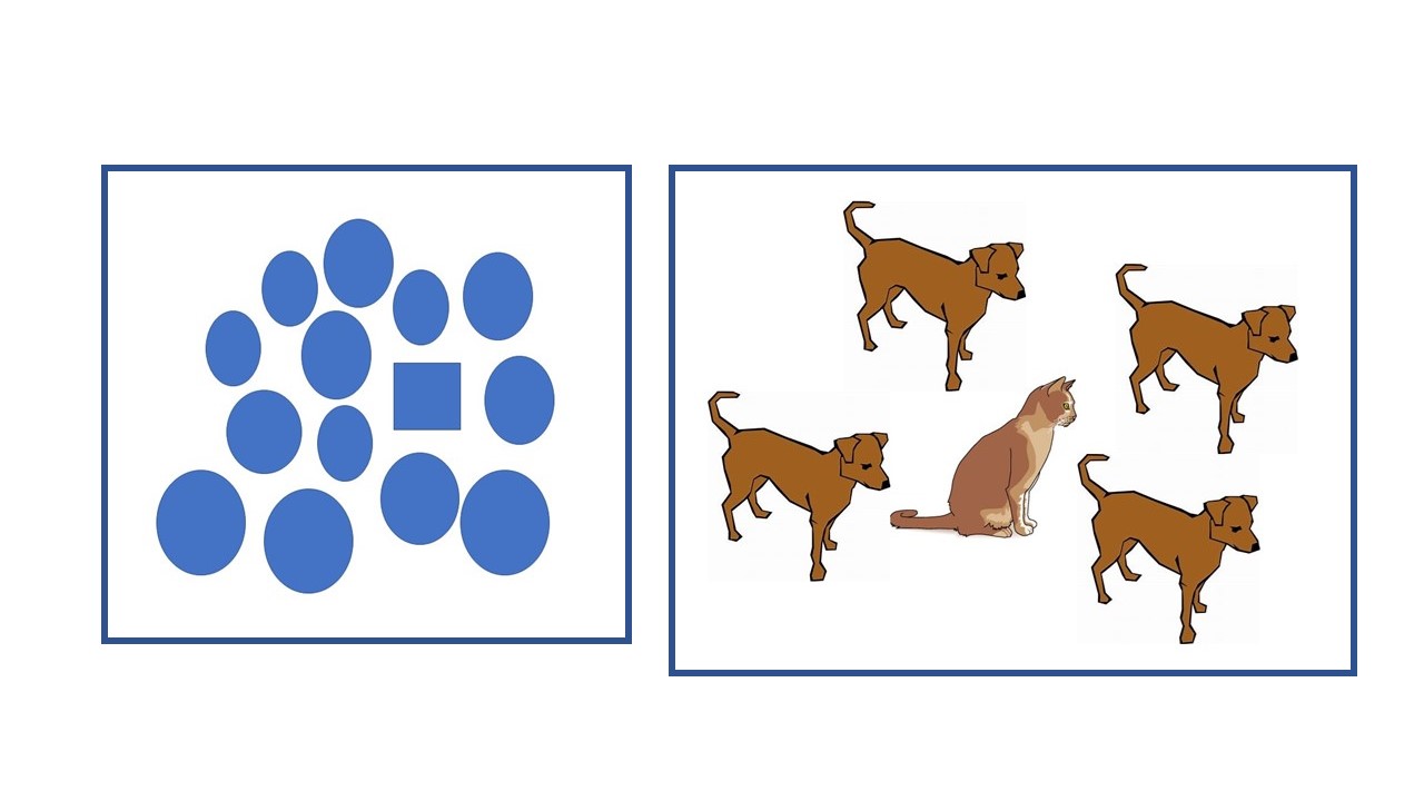
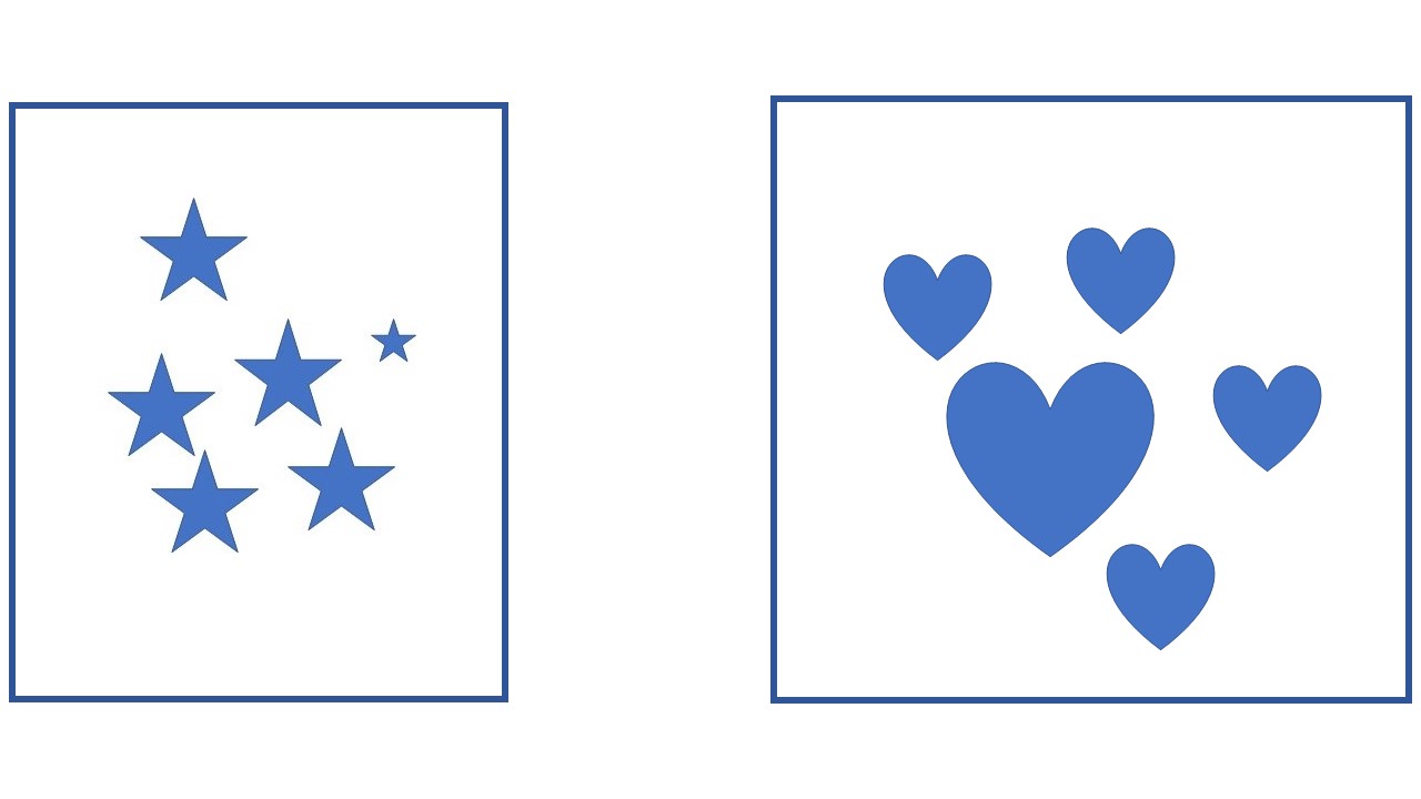
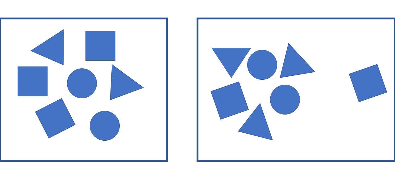
- Shape or Subject (A square amid circles or a cat within a group of dogs is another way to use contrast for emphasis.)
- Texture (A rough shape surrounded by smooth ones can make the rough shape stand out.)
- Size (Something much larger or smaller than everything else draws the eye.)
Placement: A focal point can also be created through placement. Objects placed in the center of an artwork tend to draw our attention as do isolated objects.
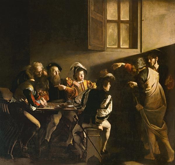
Directional lines: lead the eye to the most important part of the artwork. Directional lines can be seen in rays of light, folds of fabric, gazing eyes, pointing hands, edges of shapes, etc. You’ll notice there are several directional lines leading to St. Matthew in this painting. Even the sword of the foreground figure leads our eye to Matthew.
Directional lines can also help to unify a painting, but we’ll address that role later when we talk about unity.
Discovering the focal point of a work of art tells us what the artist is most interested in. It’s a good place to start when searching for meaning in art and when trying to appreciate how effectively an artist has composed the work.
Along with manipulating balance and creating focal points, artists have other options to consider as they arrange the visual elements. We’ll take a look at these next.
 Buy Now!


Leave a Reply