
The Art of Visual Listening 13: The Principles of Design, Part II: Scale, Proportion, Unity, and Variety
(Posted on Saturday, March 20, 2021)
In the previous post, we discussed the design principles of balance and focal point. Now let’s turn our attention to the rest of the principles: scale, proportion, unity, and variety.
SCALE AND PROPORTION – These two principles are usually grouped together because they both refer to size relationships. Artists can use size to attract the viewer’s attention (as we saw in our discussion about focal point in the earlier post), but size can also be used to enhance the meaning of a work.
- Scale refers to the size relationship of one thing to another. Scale was discussed in Lesson 4 as a way for artists to suggest a realistic sense of space. But scale can also suggest other things.
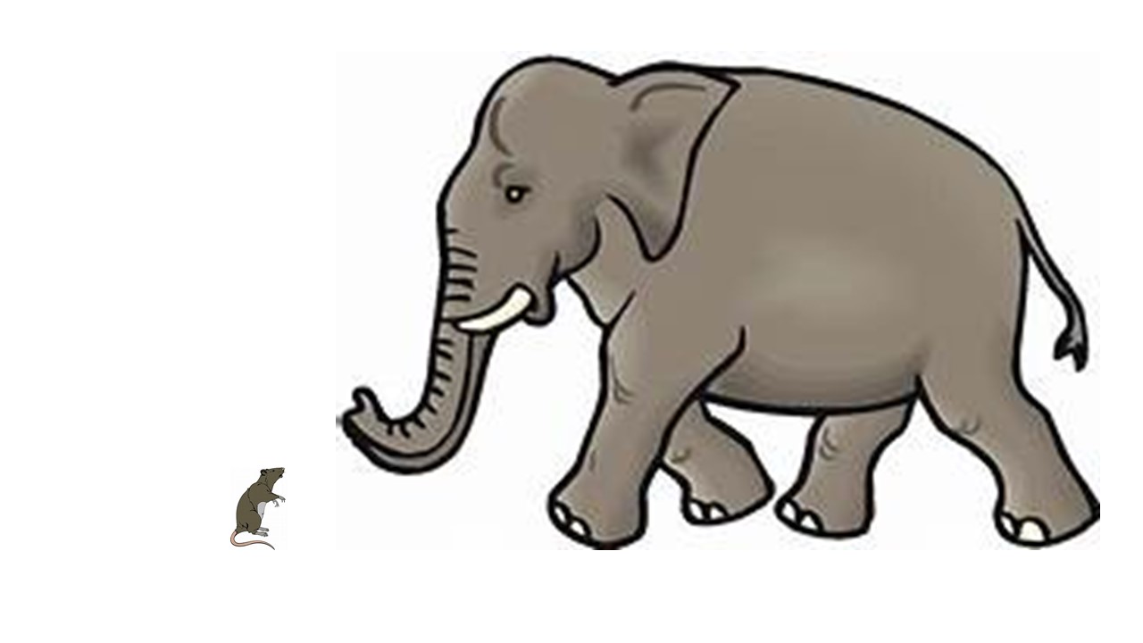
For example, if an artist depicts an elephant as very large right next to a mouse that’s very small, s/he confirms our realistic expectations of their relative sizes. This is a believable scenario. We imagine the relationship between the mouse and the elephant as natural.
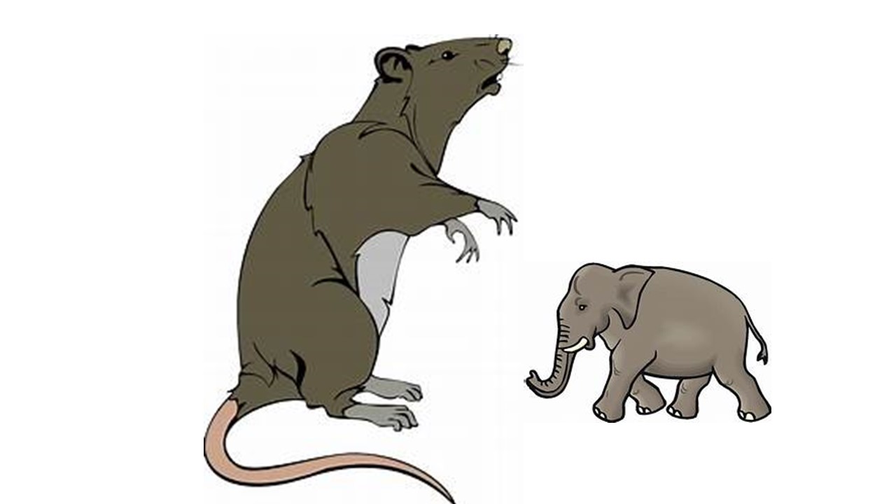
But what if the artist shows an elephant as very small next to a giant mouse? In a case like this, scale is used to emphasize the mouse in an unnatural way, to force the viewer to see the mouse and elephant in an unrealistic relationship. Distortion of scale can suggest a variety of things. Things made larger than normal can be seen as stronger, more powerful, more important, or more threatening. Things made smaller than normal can be interpreted as weaker, impotent, or insignificant.
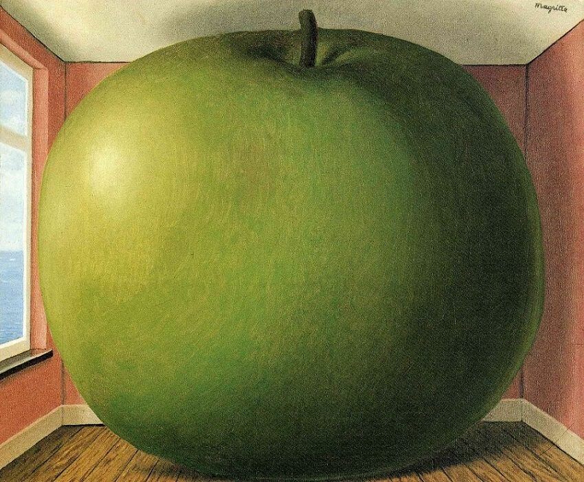
Take a look at the image of the giant apple at the top of this post. Notice how the twentieth-century Belgian Surrealist, Magritte, used scale in that painting to jar our ordinary expectations and defy logic (one of the primary goals of the Surrealists).
Or think about the ninety-eight-foot tall sculpture of Christ in Rio de Janeiro. Is there any question about what the scale of this sculpture is meant to communicate?

- Proportion refers to the size relationship of parts to a whole. We most often think of the human body when we think of proportion. As with scale, unrealistic proportions draw our attention and can rattle our expectations. We are being told this is not normal.
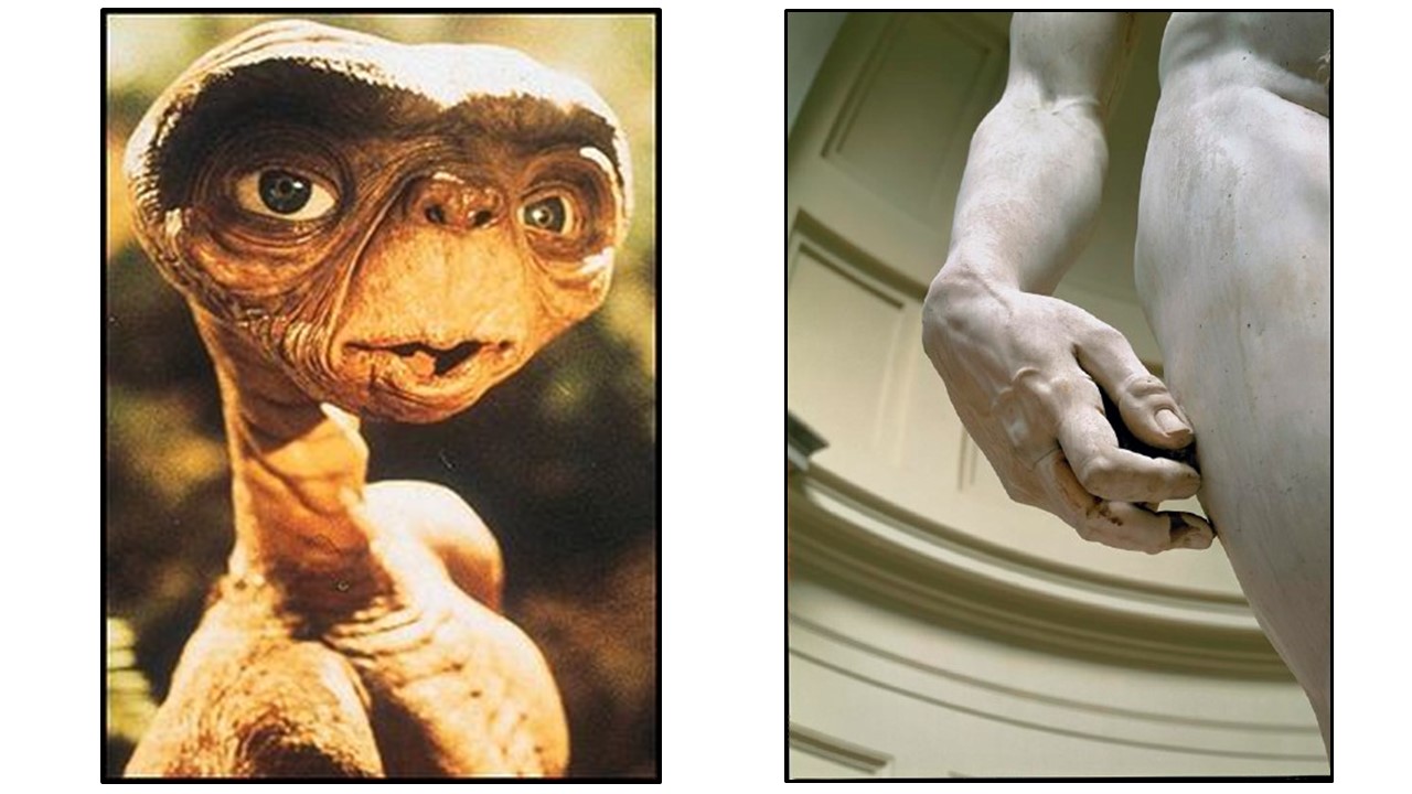
Distorted proportions can help to communicate a variety of things. The large heads of aliens in science fiction movies help to suggest an advanced intelligence, and large hands (as in Michelangelo’s sculpture of David) can indicate strength.
So, both scale and proportion can be manipulated to guide the viewer to understanding the artist’s message and to make that message clearer. These two principles can be used to present harmonious, familiar worlds, bizarre worlds, or to communicate significance (and insignificance as well.)
UNITY AND VARIETY – Unity and variety are the cornerstones of the principles of design. A unified work of art holds the viewer’s attention by keeping the eyes locked within the composition. But as the viewer engages with the artwork, there must be enough variety to keep the mind interested.
UNITY can be created in a work of art through:
- Repetition: The eye connects like things. Repeated visual elements (color, line, shape, value, texture) give a work of art a feeling of continuity. But if elements are repeated too much, they can go beyond continuity to monotony.
It sold at Sotheby’s in New York for $119.9 million in 2012.
- Proximity: The eye also connects items placed near each other, taking them in as a unit. They are seen as belonging together and thus enhance the overall compositional unity of a work. Like repetition, proximity is almost always present in a design. Most of the time, shapes are not just near each other, they overlap each other. Overlapping was discussed in Lesson 4 as a space-creating device, but it is also a unifying device.
- Directional Forces: Besides leading the viewer’s eye to the focal point, directional lines (or forces) can guide one’s gaze throughout an artwork, unifying the piece and keeping the observer visually engaged in the art.
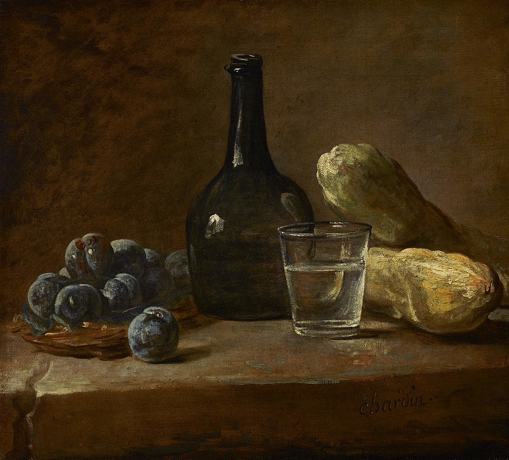
In Chardin’s still life below, notice how your eye is constantly being guided throughout and held within the painting. The crack in the table at the lower left shoots the eye to the plate of fruit which in turn directs one’s gaze to undulate around those luscious plums to the bottle. The eye moves up and down the bottle’s shape to the glass where its rim or its cast shadow guides one’s gaze to the bread lying flat and then behind and up to the bread pointing back to the bottle. Here the visual journey begins again but now in the opposite direction. The viewer’s eye is never allowed to wander beyond the humble subject of the painting which forces an awareness that would not normally take place when viewing such common objects—an awareness revealing the beauty of their simplicity.
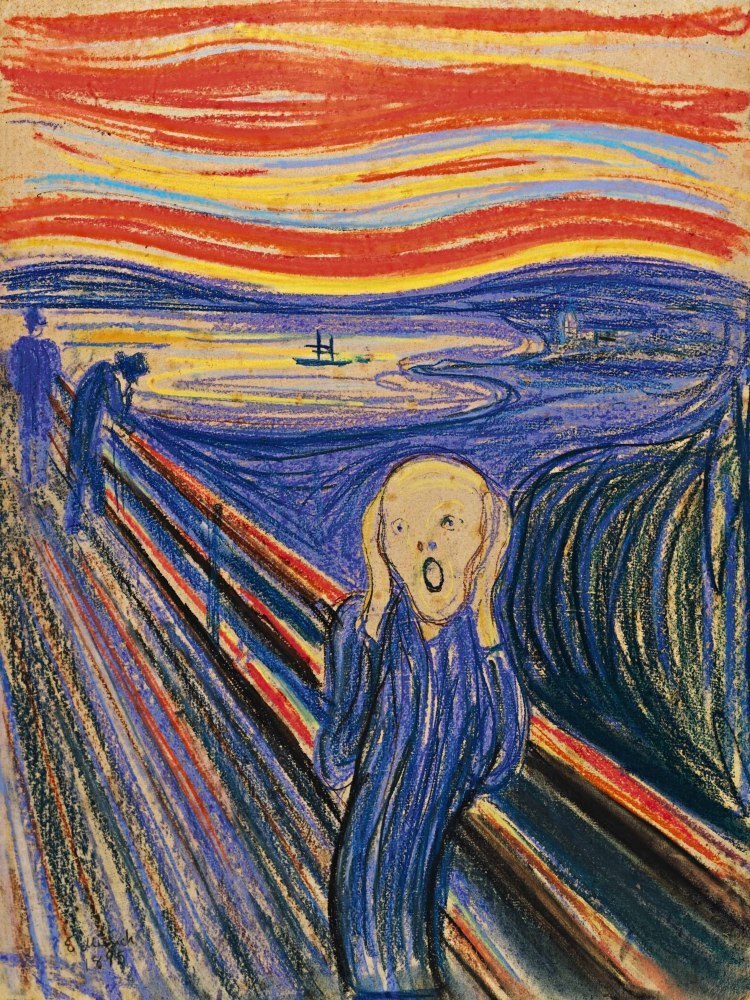
VARIETY is what keeps boredom from happening. For example, if a wavy, curvilinear line is repeated throughout a composition (as in the case with The Scream shown above), it becomes more interesting if sometimes it defines a body and other times a sunset, a lake, or shrubbery; if it runs horizontally here and vertically there; or if it’s red in certain places and yellow or blue in others.
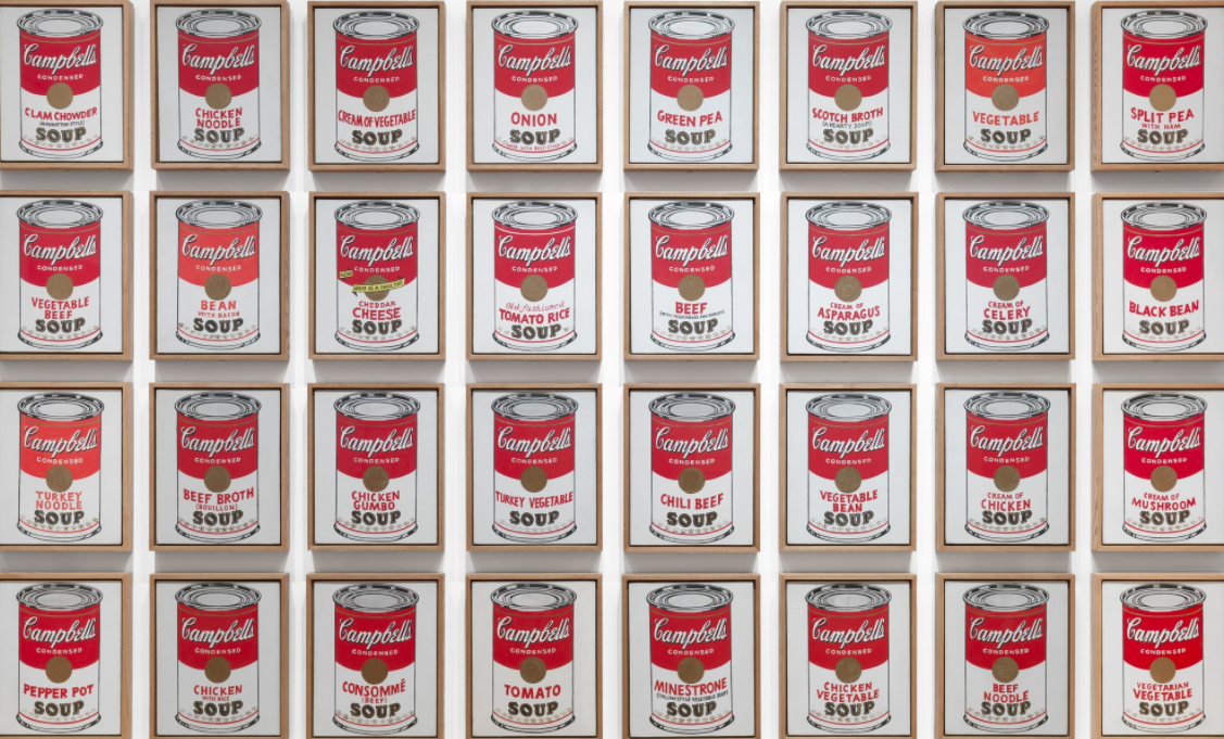
In the rare cases where an artist uses too little variety, the message is clearly about monotony, sameness, or with Andy Warhol, acknowledgment of our mass-produced, consumer culture. In reference to his Campbell’s Soup Can paintings he said, “I used to drink it. I used to have the same lunch every day for 20 years.”
And although these works by Warhol were made to look mass-produced, every painting is slightly different. Do you see his nod to variety?
But what if the artist uses too much variety? Well, as you might imagine, the message is chaos. In both cases, the rules are broken, but they are broken on purpose to enhance the message.
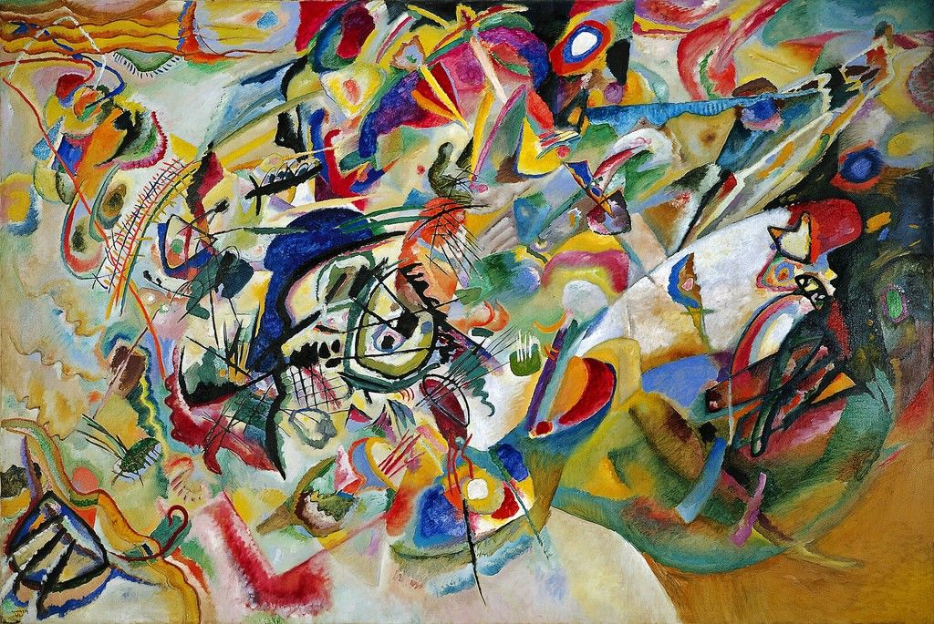
According to Kandinsky, the artist who created the above painting, a work could only legitimately be considered art if it was an unadulterated expression of the artist’s psyche—of his/her authentic thoughts and feelings. Composition VII seems to live up to his theory since it was painted in 1913, the crisis-filled year before the outbreak of WWI.
So, as we see, an artist’s manipulation of unity and variety can also give insights into what a work is saying.
Let’s pull all these principles of design together now and see how they help convey Goya’s message in the painting below.

We’ll take the principles of design one by one and examine what they can tell us. You might even want to write down your thoughts before reading mine. Here are some things to consider.
- Balance: What kind is being used—symmetrical, asymmetrical, or radial? What does the balance help to communicate? Do you think this is the most effective type of balance for this painting? Why?
- Focal point: What’s the main focal point, and how is it established (contrast, placement, directional lines)? The main focal point is the primary key to deciphering the purpose of an artwork, and it can be created in many ways. How do Goya’s choices for establishing the focal point add to the meaning of the work? Are there other focal points? How are they established? What do they tell us?
- Proportion/Scale: Has the artist manipulated scale or proportion in this work? If so, what does that do to further the painting’s message?
- Unity/Variety: Are the visual elements in this painting unified? How? What is the variety within the unity?
Although each of us will bring our own insights and interpretations to these questions, it’s the analytical process more than the answers that matters. By analyzing Goya’s design choices we have a chance to imagine ourselves in his shoes, and in so doing can better appreciate the genius behind the masterpiece.
Let me tell you how I see it.
Balance: What kind is being used? What does the balance communicate? Do I think this is the most effective type of balance for this painting?
- Asymmetrical. I’m guessing we all probably agree on this. The left side of the painting is quite a bit different from the right, especially in terms of lighting (light vs dark), background imagery (landscape vs cityscape), and the organization and poses of the figures (scattered vs regimented).
This type of balance communicates surprise which helps us interpret the scene. This is not a standard execution or a formal event. This is hasty, maybe even unofficial since it is in a field outside the city.
Focal point: What is the main focal point, and how is it established (contrast, placement, directional lines)? The main focal point holds the primary key to deciphering the purpose of this painting, and it can be created in many ways. How do Goya’s choices for establishing the focal point add to the meaning of the work? Are there other focal points? How are they established? What do they tell us?
- The main focal point is the man wearing the plain white shirt. Goya has made him the focal point by contrast. He’s brighter and lighter than everything around him (value). His pose with both arms outstretched establishes a large, distinctive shape within the painting. So the primary subject here is a brilliantly lit unarmed person in a noncombative pose.
He is also made the focal point by the repeated directional lines of the muskets pointed at him. These lines lead our eyes back to the faceless executioners as well—creating a secondary focal point that elaborates on the subject of the painting—an unarmed person in a noncombative pose about to be shot by a military firing squad.
I would say the third focal point is the man sprawled on the ground with his arms outstretched. He repeats the pose of the man in white, foretelling his fate. This figure also lies in a pool of blood, the only red/orange in the painting.
The ways Goya chose to indicate his primary focal point are also important. He is the only one dressed in a white shirt (white is often a symbol of innocence). He glows from the light of the lantern unlike anyone else in the painting. Glowing light can be associated with righteousness, godliness. His stance with outstretched arms can be seen as a crucifixion-like pose. All of these choices tell us what Goya thinks of this execution. These peasants are martyrs.
Proportion/Scale: Has the artist manipulated scale or proportion in this work? If so, what does that do to further the painting’s message?
- You might have noticed that the man in white appears to be quite large even though he’s on his knees. If he were to stand up, he’d be taller than everyone else. By adjusting the scale of this one figure, Goya makes him “larger than life,” giving him a significance greater than the specific events that befall him.
Unity/Variety: Are the visual elements in this painting unified? How? What is the variety within the unity?
- The work is tightly unified. The repeated dark colors move the eye throughout the painting but they are especially concentrated on the right where we see the multiple soldiers clustered together in almost identical stances with multiple rifles held at the same level. The repetition and the proximity of these elements unify the right side of the painting into a dark block, an impersonal killing machine. The left side of the work is also unified by repetition and proximity. The repeated figures huddle together in shared fear and pain. But their poses are not identical. These are individuals, not automatons. These two starkly opposed groups are then unified by directional forces. If your eye lands on the main focal point (as the artist intended), it can then follow the man’s arms up to the curve of the hill which can lead the eye to the right where it connects with both the architecture and the soldiers whose guns direct you back to the main focal point for the cycle to begin again. There are other pathways the eye can follow through this painting as well, but each one brings you back around to the focal point and never lets your gaze stray beyond the edges of the scene.
- As for variety, we’ve got the poses of the soldiers vs the poses of the peasants, the natural landscape vs the man-made architecture, the dark somber colors vs the brilliant white, yellow, and red.
This work is a masterpiece precisely because of the brilliant way Goya designed it. The subject matter alone is startling, but the composition—the effective arrangement of the visual elements—move it beyond being a documentation of a horrific event to an outcry against the universal horrors and injustices of war.
Click here for more information about Goya’s painting and the historic event he depicts.
At this point, we’ve completed what we set out to do in this blog series, and I hope you have found it worthwhile. But before you go, you might want to check out my final post “The Whole Ball of Wax” in which I pull together all the various elements we’ve discussed in this series and apply them to an artwork in my collection with the goal of analyzing the piece for better understanding and appreciation. Sound interesting? Click on!
 Buy Now!


Leave a Reply