
The Art of Visual Listening 3: Art and Beauty
(Posted on Friday, April 7, 2017)
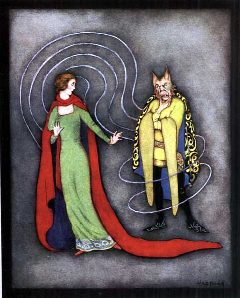
Beauty and the Beast illustration by Jennie Harbour, 1921 [Public domain], via Wikimedia Commons
Having already explored “What Is Art?” and “Why Is Art?” we’re now ready to consider the sticky role beauty plays in our understanding and evaluation of artworks.
Some people believe beauty is the primary purpose of art. If a work isn’t beautiful, some would claim, it isn’t art at all. There are also those who insist beauty rests solely in the eye of the beholder, so if that’s the case, what does beauty even mean and how can we possibly use beauty to evaluate art on a universal scale?
In order to address the relationship between beauty and art, we need to first investigate the concept of beauty so we have some understanding of how slippery it can be.
Beauty (according to Merriam-Webster’s) is “the quality or aggregate of qualities in a person or thing that gives pleasure to the senses or pleasurably exalts the mind or spirit.” Well, that’s a start, but this definition skirts the issue of whether beauty is objective or subjective. Does everybody’s mind exalt at the same thing (think of a perfectly formed rose), or can something be beautiful to one person and ugly to another? Or is it a little of both? (1)
According to the eighteenth-century Scottish philosopher, David Hume, beauty is not inherent in objects but exists entirely in the mind of the person contemplating the objects. So, he argues, each mind can perceive beauty differently. From this perspective, then, beauty is a subjective experience.
But if beauty is only in the eye of the beholder, the word has no real meaning. When I say something is beautiful what does that communicate to you beyond my own idiosyncratic response? And aren’t there some things that most everyone sees as beautiful like this landscape for example?
 Photo by the author
Many philosophers, way before Hume, puzzled over the objectivity or subjectively of beauty. The fourth-century Christian philosopher, Augustine, questioned whether things are beautiful because they give pleasure, or whether they give pleasure because they’re beautiful. He sided with the second option as did the ancient Greek philosophers before him, Plato and Aristotle.
In Plato’s fourth century BC Symposium, beauty is explained as an unchanging ideal form outside our temporal world. We perceive objects as beautiful because they are reflections of that eternal, abstract concept of beauty, that ideal form. For Plato, beauty does not depend on subjective individual perception.
Beauty is also objective for Aristotle. He too believes it exists outside the subjective experience of the beholder. For Aristotle, though, beauty is a matter of proportions, the harmonious arrangement of parts to a whole. A good example of this idea can be seen in the Greek sculpture, Doryphoros (or Spear Bearer), by the fifth-century BC sculptor, Polykleitos. (2) The original bronze no longer exists, but Roman copies, like this one, do.
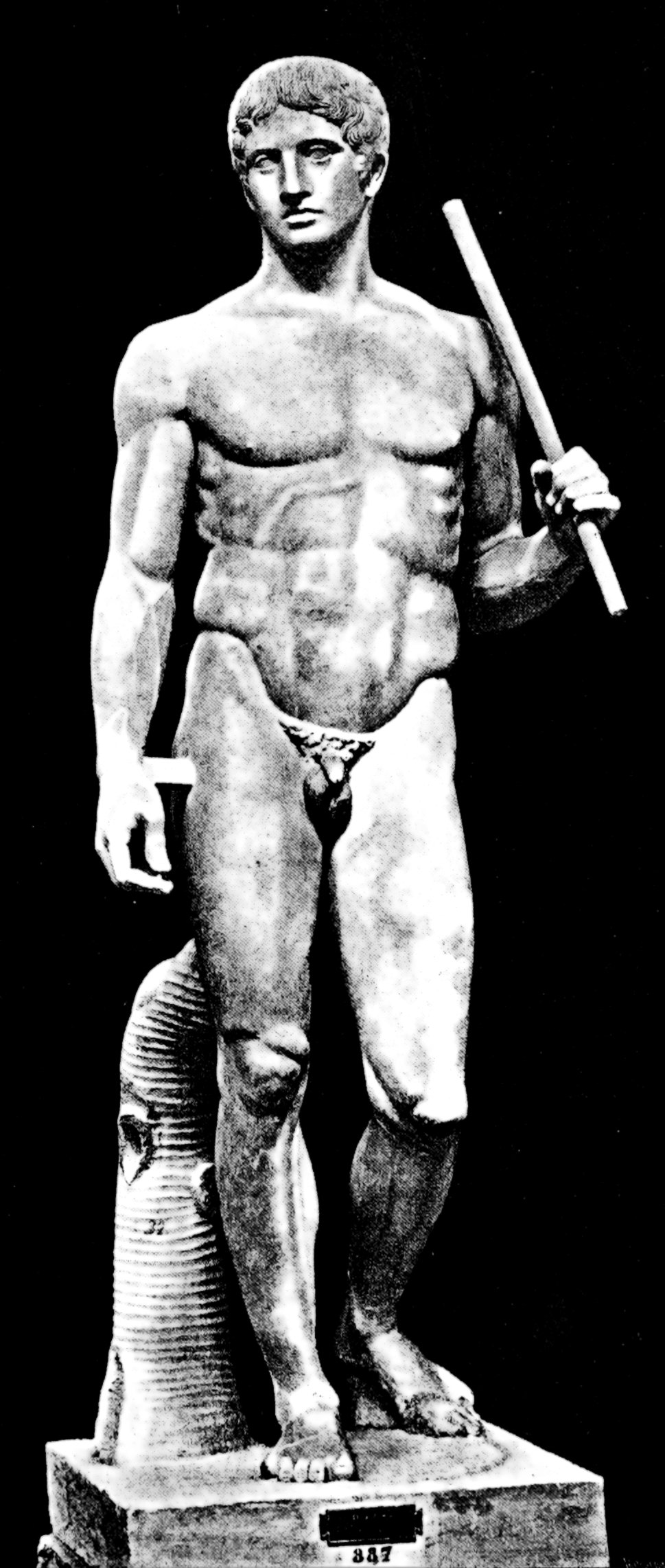
In this sculpture, Polykleitos sought to depict the concept of beauty by using mathematical ratios to establish perfect proportions for the human form. Polykleitos called this sculpture Canon, meaning it was intended as a model for others to follow like a roadmap to beauty.
Okay, so which is it, objective or subjective? Well, I’d say it’s a bit of both. Although Hume and Immanuel Kant (another eighteenth-century philosopher, this time German) weighed in on the side of subjectivity, they both recognized that many times people agreed on what was beautiful. But instead of saying it was because of an abstract ideal or perfect proportions, they believed any consensus about beauty was the result of social and cultural considerations. (We’ll come back to this point later.)
So what does all this have to do with understanding art and its evaluation? Well, I guess the most important thing is to realize that beauty is hard to pin down, which makes it an unreliable yardstick for assessing the quality of art. You may personally prefer art you believe to be beautiful, but that’s not necessarily a dependable criterion for evaluating its quality in a more universal context, and it may not provide any clues at all as to whether the work will stand the test of time.
Remember, the ultimate goal of art is communication: to commemorate; tell stories; express ideas, feelings, and beliefs; to persuade and interpret, and to generally reflect on the world around us and within us. And that world (as we all know) is not always beautiful. Some of the most meaningful experiences of life are the most painful and some of the most powerful images in life can be the most difficult to view…like birth or death.
These days, we seem to accept disturbing images more readily in film and photography than painting and sculpture. Some highly acclaimed films contain scenes that can make the most experienced eye wince and yet we’re okay with that. We can see the art within the horror. But with paintings and sculptures, it seems to be different. We desperately want them to be visually pleasing and fit our individual concept of beauty (not to mention our living room décor).
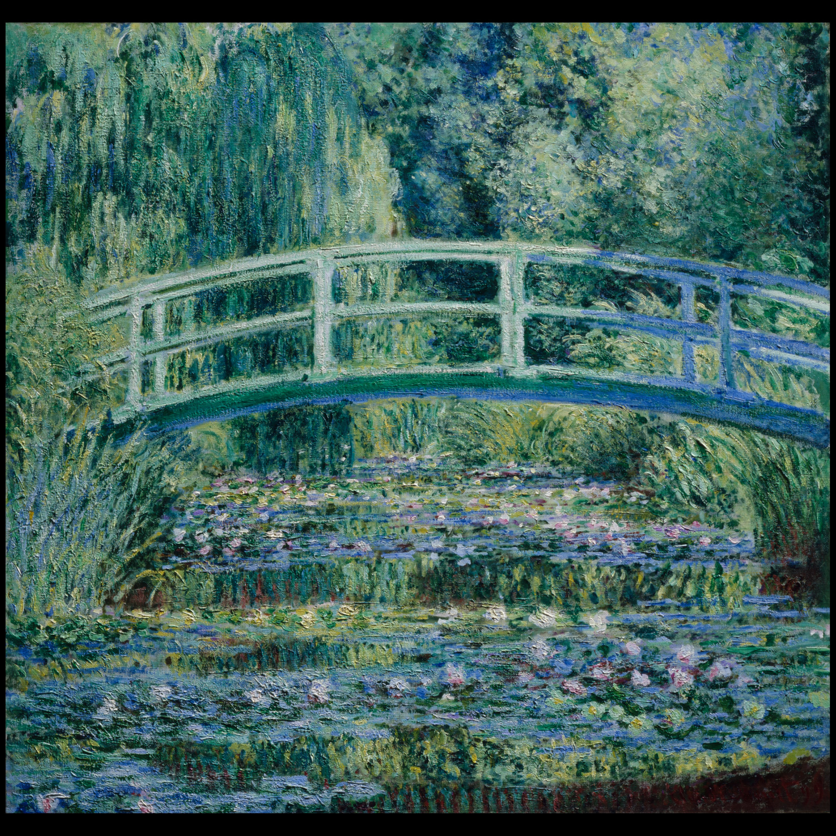
It also seems to some that the great works of art from the past were always beautiful, unlike today’s art. Michelangelo’s sculptures, Leonardo’s paintings—beautiful. Or this 1898 Impressionist painting of water lilies by Claude Monet—exquisite. (3)
But in our contemporary times, according to these folks, art has taken a turn for the worse. To them, what the art world considers significant today is anything but beautiful.
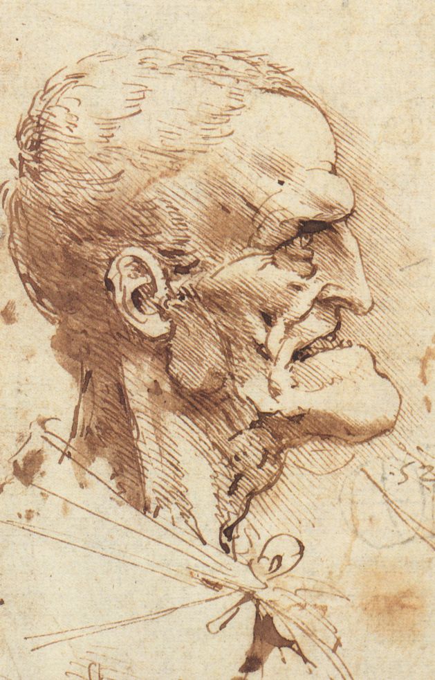
This, though, is not exactly true. Yes, Michelangelo, Leonardo, and Monet created beautiful artworks by anyone’s standards, but not everything they created was beautiful. Consider this drawing by Leonardo.
Art, as an expression of humankind, has always shown us the disturbing and the ugly along with the beautiful. Remember the scene of the damned from the twelfth-century Autun Cathedral in my last post? Not exactly pretty. Or how about this painting by Francisco Goya of Saturn Devouring His Son? (4)

Pretty horrific if you ask me. But it’s a gripping expression of the artist’s mental state (He painted this on his dining room wall, by the way.) and a powerful statement of how he felt about the political strife in Spain at the time. Saturn devoured his children, according to the Greco-Roman myth, to keep them from overthrowing him as adults.
Another caveat to using beauty as the criterion for evaluating art is people have been known to change their minds. Some artworks, reviled in their own times as ugly, have been transformed by history into gorgeous masterpieces cherished by all. Let’s take those Impressionist paintings for example. We swoon over them now, but they were considered hideous by the art establishment when first exhibited. Even the name, Impressionism, was a slam from a critic, indicating these artists were so unskilled they could only paint impressions of things. So how does this happen? How does art originally considered to be ugly by most people later appear to be just the opposite?
There are many reasons, but sometimes it’s because art reveals things that society isn’t ready to accept. And sometimes those things don’t look very pretty at the moment. They are just too new to the eye and too foreign for the mind to understand. Maybe the creative leap is too big or the truth being revealed too powerful. Remember Hume and Kant’s idea—when there is a consensus on what is beautiful, it’s the result of social and cultural considerations, not a fixed abstract concept?
So sometimes, it takes creative vision and open-mindedness on the part of the viewer to go beyond existing social and cultural conventions and find the beauty in a contemporary artwork that the next generation of viewers may have no problems seeing.
A good example of this is Manet’s painting, Le Dejeuner sur l’herbe (Luncheon on the Grass) exhibited in Paris in “Le Salon des Rufuses” (The Exhibit of the Rejected) in 1863. (5)
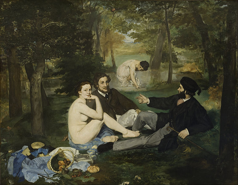
The show was intended to appease the angry artists who were routinely rejected by the French Academy of Fine Art (the only place to exhibit your works in Paris at that time in the nineteenth century). Of course, you can imagine, being publically labeled “rejected” was not exactly what the artists had in mind, and you can also imagine viewers were predisposed to dislike the works in an exhibition with a name like that. But for Manet, it was even worse.
Manet’s painting was considered one of the worst, most laughable, and most obscene paintings on display. (Since there were 2,783 works shown in all, being worst was quite a pejorative distinction.) The art critic, Chesneau, summed up Manet and his painting like this: “Manet will show talent once he learns drawing and perspective, and taste once he stops choosing his subjects for the sake of scandal. We cannot find it altogether a chaste enterprise to set down under the trees, beside students in cap and gown, a female clad only in leafy shade . . .”
So what was really wrong with Manet’s painting? Well, basically, it did not conform to the collective social and cultural concept of beauty at the time.
- It was painted in an unconventional way with flattened shapes instead of meticulously shaded shapes. Because of this, the painting didn’t look three-dimensionally real (as paintings at the time were expected to look). Instead, his unfamiliar technique looked amateurish and downright ugly.
- It showed a nude with nothing to identify her as imaginary, that is to say, as a goddess, nymph, or muse. Stripped of mythological pretense, there was only one way to look at her, as a real naked woman picnicking with contemporary male students. The collective conclusion: She must be a prostitute. What kind of depraved artist would dare insult the sensibilities of good people by painting such an immoral scene?
- It extolled the ordinary, an affront to the aristocracy who were hanging on in France by a thread in the face of growing democracy. Small paintings could depict everyday people without controversy, but large-format works were required to confirm the tastes and the superiority of the ruling class by depicting lofty subjects with mythological, historical, or religious themes. Manet’s painting is almost seven feet high by nine feet wide and there’s nothing lofty about its subject.
- Bottom line, Manet’s painting was “bad” because it was seen as a threat to the status quo.
Today this painting is considered seminal in the development of modern art of the twentieth century. But most of the art-going public could not have foreseen that. They were so focused on judging this work according to their current concept of beauty; they missed its real beauty, its rebellious, experimental, and spot-on reflection of the changing times.
So next time you see a work of art that does not strike you as beautiful and provokes in a negative way, it might well be that it’s expressing some new truth about society in some new way that you’re not prepared to comprehend. And that work, that disturbing work, might just be the one that actually withstands the test of time.
A negative response to these kinds of images is the easy way out. The challenge is to have the creative vision to see the work outside our existing conventions of beauty. But having “the creative vision to see” takes cultivation. We need to learn to see and not just look. So what does that mean exactly?
We’ll explore that question in the next post: Seeing, Perception, and Creativity.
Footnotes
(1) For more on beauty and art, go to: https://plato.stanford.edu/entries/beauty/
(2) Doryphoros (Spear Bearer), by Polykleitos., more information: http://employees.oneonta.edu/farberas/arth/ARTH209/Doyphoros.html
(3) French Impressionism, more information: http://www.metmuseum.org/toah/hd/imml/hd_imml.htm
(4) Saturn Devouring His Son by Goya, more information: https://eeweems.com/goya/saturn.html
(5) Dejeuner sur L’herbe (Luncheon on the Grass) by Manet, more information:
http://www.visual-arts-cork.com/paintings-analysis/luncheon-on-the-grass.htm
Image Credits
Mountainscape with Yellow Flowers
- Photo by the author
Doryphoros (or Spear Bearer), by Polykleitos, 450-440 BC, National Archeological Museum of Naples. Naples, Italy
- [Public Domain], via Wikimedia Commons
Water Lilies and Japanese Bridge by Claude Monet, 1897-1899, Princeton University Art Museum. Princeton, New Jersey
- [Public domain], via Wikimedia Commons
Grotesque Profile by Leonardo da Vinci, 1487 – 1490
- [Public domain], via Wikimedia Commons
Saturn Devouring His Son by Francisco Goya, 1819-1823, Prado Museum. Madrid, Spain
- [Public domain], via Wikimedia Commons
Dejeuner sur L’herbe (Luncheon on the Grass) by Edouard Manet, 1863, D’Orsay Museum. Paris, France
[Public domain], via Wikimedia Commons
 Buy Now!


Leave a Reply