The Art of Visual Listening 8: Into the Depths
(Posted on Sunday, January 12, 2020)
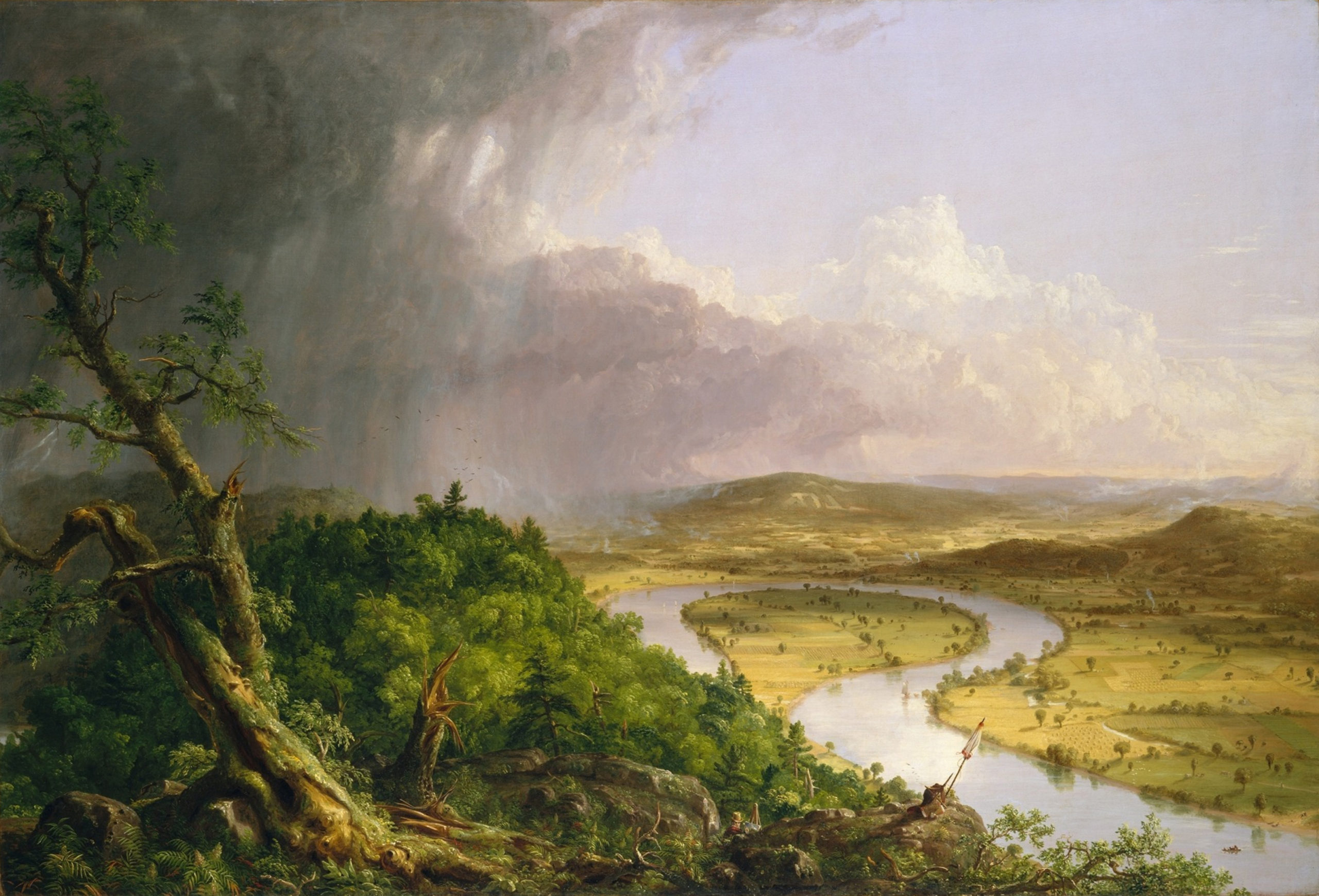 Thomas Cole, The Oxbow, 1836 [Public Domain]
Like the other visual elements, the illusion of depth or three-dimensional space in art is based on the way we see things in the real world.
Whether an artist wants to create a sense of depth or avoid it, she needs to know what makes that illusion happen—what makes us see objects as near or far when everything we’re looking at in a painting, drawing, or photograph is really on the same flat surface.
Space-Creating Devices: In the real three-dimensional world, our perception of depth depends on a series of visual clues. When artists use these same clues in their works, we can be tricked into seeing a perfectly flat surface as a window into space.
In the context of art, I like to refer to those real-world clues as space-creating devices.
Let’s begin by identifying each device individually. But keep in mind, they’re most convincing when used in combination.
- Overlapping – When a shape appears to be partially blocked from view by another shape, we interpret it as behind the other one.
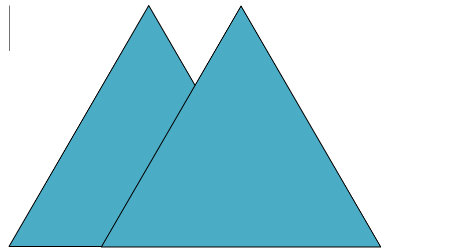
- Placement – Things located higher up on a picture plane can look farther away than those placed lower.

- Size – An object can also seem farther away when it’s smaller than another object (especially when the smaller one would normally be bigger).


- Color – Warm colors–red, yellow, and orange–tend to advance toward our eyes, making them appear closer to us. Cool colors–blue, green, and purple–tend to recede, making them look farther away.
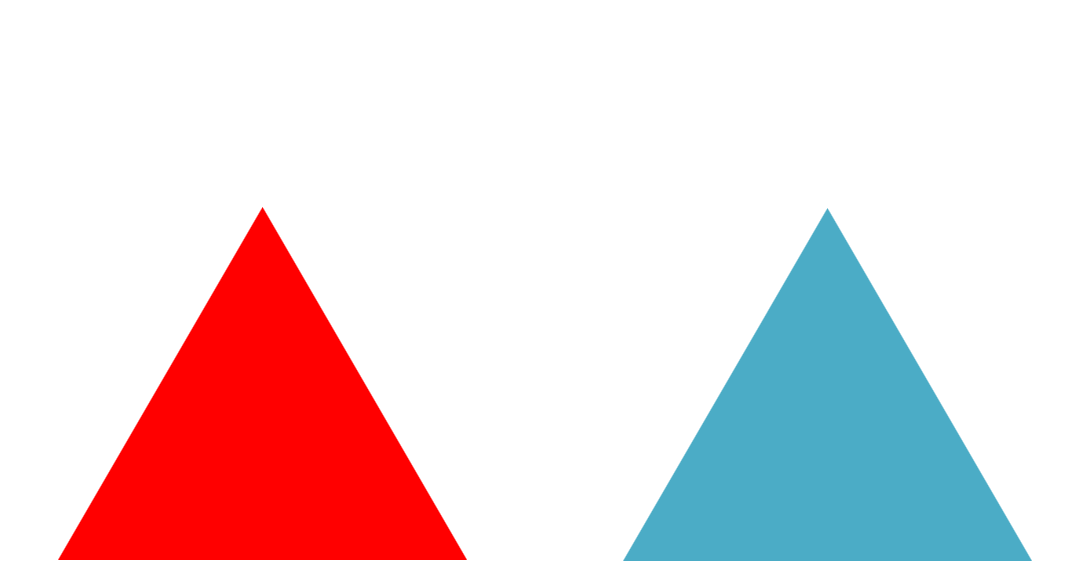
The sense of depth created by warm and cool colors alone is often hard to discern. At first the two triangles below appear to be on the same flat plane, but if you look at them for a while, you may begin to notice how the red moves toward you and the blue pulls back, giving a slight spatial illusion. (We’ll talk more about color as a separate visual element in the next chapter.)
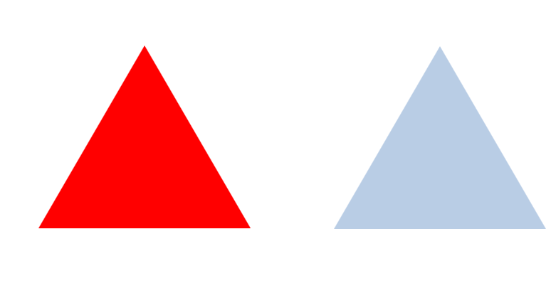
- Atmospheric or Aerial Perspective – If the above triangle on the right were pale instead of bright blue, it would have given off a much more convincing sense of depth. We see this in nature all the time, especially in distant mountains. When a mountain takes on the color of faded purple or blue-gray, we know it’s very far away from us. We call this visual effect atmospheric perspective.
Notice how much more the blue recedes in the example below compared to the one above.
- Combination: By combining all the space-creating devices discussed at this point—overlapping, placement, size, color, and atmospheric perspective—we get the most convincing impression of depth so far.

- Linear Perspective – We see the above five spatial clues everywhere in our real world, but linear perspective is a more specific space-creating device and more complicated. It only occurs when parallel lines are moving away from us into depth. Under those circumstances, the lines appear to converge toward each other like the outside rails of railroad tracks for example.
But there’s more to it than that.

If one could see those converging parallel lines all the way to the horizon, they would actually appear to meet. That spot where they touch is called the vanishing point. And the vanishing point is always smack on the horizon as the image above demonstrates.
- The Horizon and Your Eye Level: Not only is the vanishing point always at the horizon, but so is your eye level. You can easily experience this at the ocean. Looking straight out at the water, you’ll notice the horizon is the same level as your eyes.
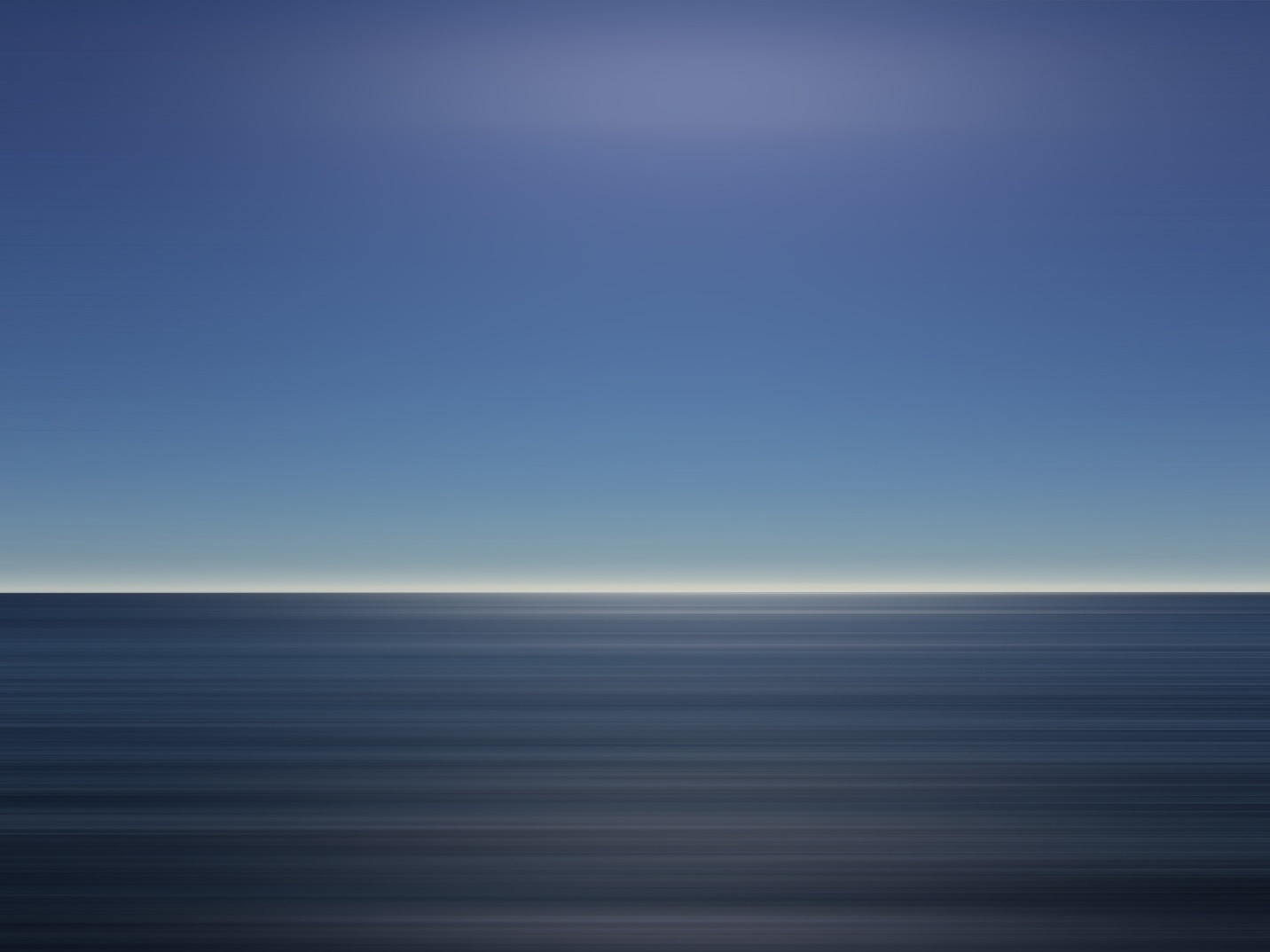 Image by Free-Photos from Pixabay
Whether you are standing, sitting or lying down, the horizon seems to adjust itself to your eye level, not above it or below it, but right there.
Take Leonardo da Vinci’s Last Supper for example. To create an accurate illusion of 3-D reality (as Leonardo did), the vanishing point for those converging ceiling beams must fall on the horizon line of this painted space. And that line must correspond to the viewer’s eye level.
Take a moment to follow the trajectory of those beams to their vanishing point. Got it? If so, where does that put your eye level?
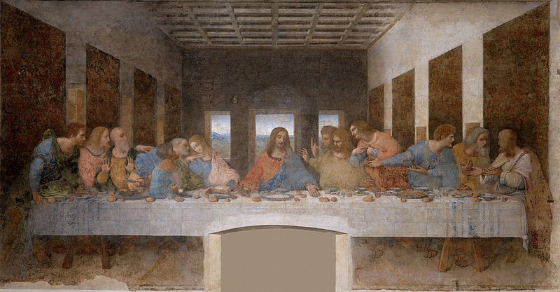
Leonardo da Vinci, The Last Supper, 1498 [Public Domain]
Yes! You’re eye to eye with Christ.
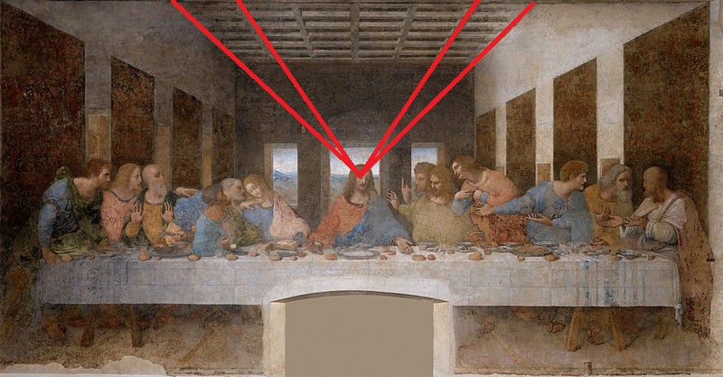
When our eye level is the same as the figures in a painting we feel like we’re part of the action. This is a powerful way to draw us into an artwork emotionally.
Let’s try another one. Where has the artist placed you, the viewer, in relationship to the painting below?
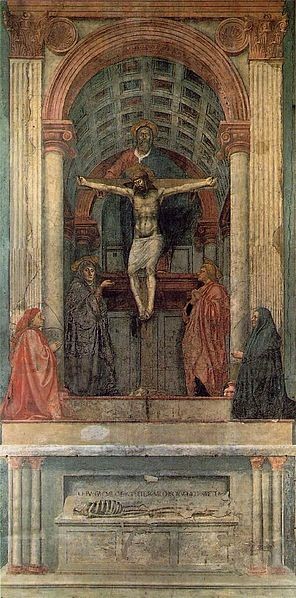
Masaccio, The Holy Trinity, 1425 [Public Domain]
Were you able to follow the converging parallel lines in the vaulted ceiling to the vanishing point at the base of the cross?
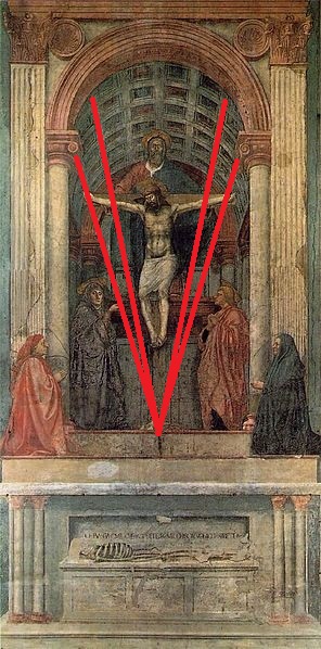
In this work, the artist has located us in a reverent position, below and outside the painted chapel. We are firsthand witnesses but not participants.
And what if an artist wants the viewer to experience a scene from a distance? This can also be accomplished by adjusting the horizon line.
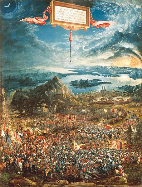
Albrecht Altdorfer, The Battle of Issus, 1529 [Public Domain]
Look how high the horizon is in the painting above. That means we’re up there too—on a mountain top or in a hot air balloon. We’re not participating in the skirmish but viewing it from afar. This is especially appropriate here because the battle in this painting took place in 333 BCE. The artist is reminding us of our historical distance.
By manipulating the viewer’s eye level, the three artists above created spaces to be experienced in entirely different ways—as participants, firsthand witnesses, and distant observers.
And all three of those paintings are considered to be masterpieces. Imagine how different those works would look if the artists had depicted them from other points of view. Would the Last Supper be as emotionally compelling if we were looking down on the scene? Would the Battle of Issus seem as historically distant if we were viewing the struggle at eye level?
Abstract and Nonrepresentational Art: So far, I’ve been using representational paintings as my examples, but the illusion of space is also found in abstract and nonrepresentational works. You can easily see that in the image below. The artist’s use of space-creating devices helps us perceive some parts of this painting as near us and others as vistas into deep space.
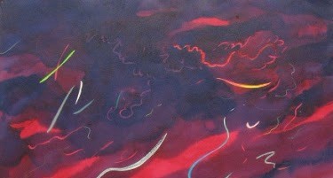
Roger Mendes, Untitled (detail) [permission granted by the artist]
Do you see where overlapping, size, and color help create an illusion of depth?
Do you also see there’s no discernible horizon in this painting and no converging parallel lines to suggest one? By leaving out a horizon, the artist has liberated us from the earth. And that’s what I feel when I view this piece—liberated. I’m transported away from solid reality. A horizon line would have changed that feeling completely.
Just for fun: Look at the engraving below drawn by William Hogarth and engraved by Luke Sullivan. Hogarth created the drawing for a friend’s publication about linear perspective and gave the work the following subtitle (which you can partially make out below the engraving): “Whoever makes a design without the Knowledge of perspective will be liable to such Absurdities as are shewn in this frontispiece.”
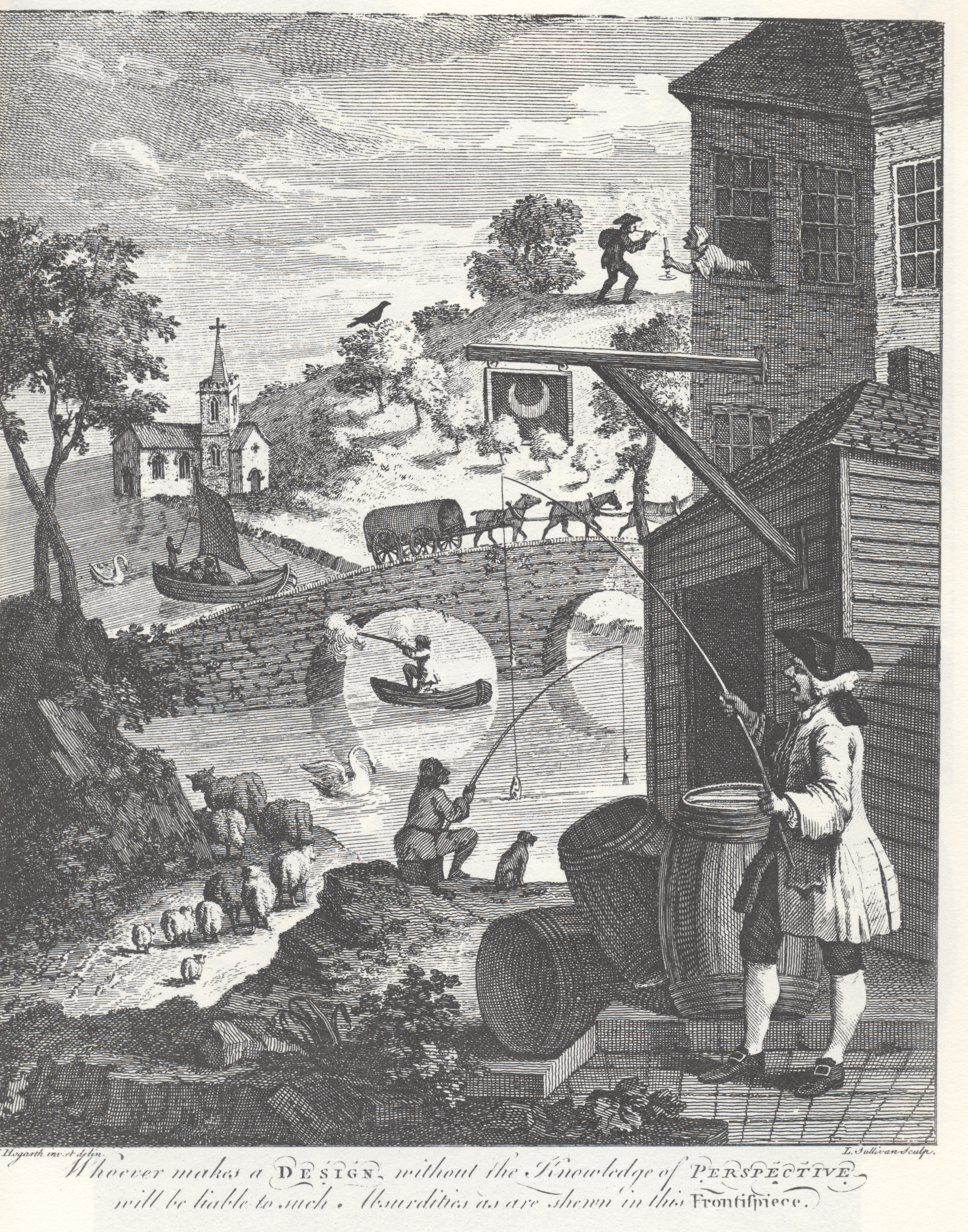 William Hogarth, Satire on False Perspectives, 1754 [Public Domain]
Can you spot the many crazy perspectives in the above work? If you’re curious whether you found them all, you can compare your tally with the list on Wikipedia.
Before you go: Take another look at the image at the very top of this post, The Oxbow by Thomas Cole, and note how well the artists has combined the space-creating devices to communicate the vastness of nature compared to the insignificance of humans.
Although that comparative theme may not be obvious in the reproduction posted above, it’s clearer in the details below.
Do you see the artist nestled behind the rocks in the foreground with his collapsed umbrella poking out in front of the river to the right?
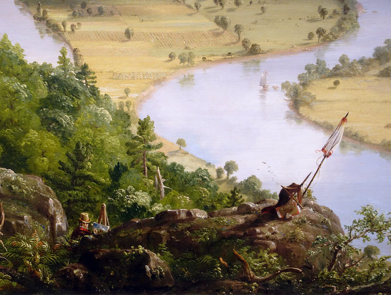
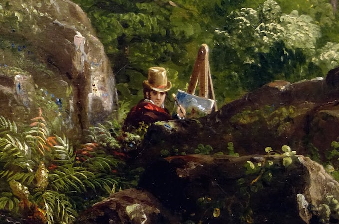
Without such expert manipulation of space, this painting could not communicate its theme so powerfully, and it would not be the masterpiece it is.
Image Credits
The Oxbow
- Thomas Cole [Public domain] vis Wikimedia Commons. For more information: https://smarthistory.org/cole-the-oxbow/
The Last Supper
- Leonardo da Vinci [Public domain], via Wikimedia Commons. For more information: https://smarthistory.org/leonardo-last-supper/
The Holy Trinity
- Masaccio [Public domain], via Wikimedia Commons. For more information: https://smarthistory.org/masaccio-holy-trinity/
The Battle of Issus
- Albrecht Altdorfer [Public domain], via Wikimedia Commons. For more information: https://smarthistory.org/albrecht-altdorfer-the-battle-of-issus/
Untitled
- Roger Mendes, [Permission of the artist]. For more information: http://www.rogermendesartist.com/artworks
Satire on False Perspectives
- William Hogarth (designer) and Luke Sullivan (engraver) [Public domain], via Wikimedia Commons. For more information: https://en.wikipedia.org/wiki/Satire_on_False_Perspective
Email Sign-Up
Enter your email address to join the mailing list.

 Buy Now!

Leave a Reply