The Art of Visual Listening 5: Form and Content
(Posted on Sunday, July 28, 2019)
I don’t know much about art, but…
That familiar expression—“I don’t know much about art, but I know what I like—would be more accurately phrased this way:
“I don’t know much about art, but I like what I know.”
Liking what we know is human nature. What we know is clear, reassuring and in that way, easy to like or at least feel comfortable with. What we don’t know feels strange, uncomfortable, and sometimes a little scary.
So let’s get scary for a moment and explore three basic forms of art—from the known to the unknown.

Form and Content
In order to “like” or appreciate art, we need to learn its language. And to do that, we need to study the artwork’s form—its physical appearance. Understanding the form helps us decipher the work’s content—it’s meaning or message. Once we hear that message, we’ve opened up the lines of communication and have a chance to become friends. We still might not like the work a lot, but now we have some understanding of its content which allows us to evaluate it more objectively. And, depending on the form the artwork takes, the content can be easy to grasp or more challenging. The more familiar the form, the easier it is to hear the message.
So our goal here is to get familiar with form.
At its most basic level, form falls into three general categories. Each category provides a framework through which to view the artwork — a starting point for interpreting the artwork’s content and hearing what it has to say.
Caveat: Before we explain these categories, though, you need to know they’re general. Not all artworks fall neatly in one slot or the other. So, please use these terms as aids to understanding, not as absolutes.
- Representational art seeks to depict things as they actually appear—optically real, tangible, and believable. It doesn’t matter if the things truly exist in nature (like Bigfoot or the Lochness Monster). It only matters that they’re depicted as if they do.
Photographs are often representational. They can duplicate the world as we normally see it. The photograph of the fox below is a good example of this.

Representational art is more readily accessible than the other two categories and easier for most of us to appreciate. If the work duplicates our visual realm accurately, we can appreciate the artist’s skill and recognize how well that goal has been accomplished. We feel confident in our judgment when it comes to representational art. It’s already familiar.
We can also easily derive meaning from the work because we’ve gleaned that same content before from the world around us. Look at the photo above. What does it tell us? We’ve seen that look on people and animals. He’s focused, calm but alert, comfortable in his surroundings. But don’t underestimate him, especially if you’re a mouse.
- Abstract Art takes our real, tangible, believable world and distorts it. The subject can still be recognized, but it doesn’t look the way we expect to see it.
When an artist chooses to veer from nature, we often find ourselves in unfamiliar territory. If we were to evaluate an abstract work of art according to our representational art standards, the work would fall short. It would not look real and, using that criterion, would not communicate with us effectively. We would find little value in it. So we need to view abstract art through a different lens.
First, we need to recognize the work as abstract and the distortion as intentional. The artist seeks to emphasize something other than standard surface appearances. So instead of evaluating an abstract artwork based on our everyday reality (where it’s sure to fail), we need to focus on the new reality the artist has created and what those distortions from nature communicate.
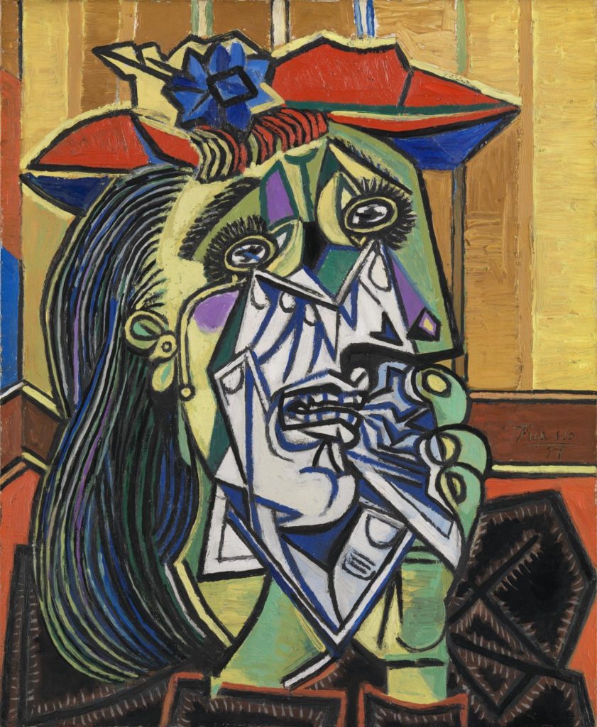
Look at Weeping Woman below by Picasso. (1) It’s a terrible image as far as reality is concerned. But Picasso wasn’t trying to duplicate the real surface appearance of this woman. He was shooting for a different reality, one that cracks the surface. His Weeping Woman looks unrealistic, but her fractured face makes her real shattered emotions tangible, and that’s the content he’s emphasizing. She’s not crying over a broken dish. She herself is broken.
From this perspective, the work is not a terrible image at all, but a gripping one, communicating a deep sense of emotional trauma more powerfully than most representational artworks could. Once we can understand what the work is saying, it’s no longer an unknown. And we can appreciate and evaluate it on its own terms.

- Nonrepresentational Art does NOT seek to duplicate or distort the real world. It lets the visual elements of art—line, shape, color, light, space, and texture—speak for themselves.
Although nonrepresentational art is sometimes defined as an extreme form of abstract art, I prefer to make a distinction between the two because their goals are different. And recognizing this distinction gives us an edge for understanding content.
With abstract art and representational art, the content is tied to a narrative, a scene from our real world. But nonrepresentational art, as the name implies, has no concrete story to tell. So there’s no reason to look for one. We must approach this art from another angle. We need to ask what the visual elements make us feel or think.

Look at the painting above. Sure, we could spend our time trying to “see” something from the real world in there, trying to make it look familiar to us, but since it’s a nonrepresentational work, that would be a useless exercise. Even if we came up with something, it wouldn’t be what the work’s about. Instead, we need to recognize its nonrepresentational form and approach it from that angle—from what it makes us think or how it makes us feel.
This is sometimes difficult for us to do. Looking at a bunch of undecipherable blobs of paint can seem pointless. Where’s the meaning in that? But if you look at those blobs and pay attention to your thoughts and feelings, you can hear a symphony.
The work above, for example, makes me think of raw energy and makes me feel energized, flooded with a surge of powerful emotions. The crashing diagonal movement, luscious conflicting colors, and rich textures vitalize my senses. Bottom line, the painting makes me feel alive, and I can relate to that. I can appreciate that.
Of course, you may feel something different when you look at the work. And that’s fine. The point is to approach art from a direction that helps to open up communication between you and the piece. And one way to determine the best direction is to recognize the artwork’s basic form. This helps make the art easier to read, befriend, and evaluate.
But there’s much more to form than these three categories. They only give us a framework. In the next series of posts, we’ll go beyond the frames and delve into the details —the visual elements—and all they have to tell us.
Footnotes
(1) If you’d like to learn more about the Weeping Woman series, Picasso, and the sitter for the painting, Dora Maar, check out: https://www.pablopicasso.org/
Email Sign-Up
Enter your email address to join the mailing list.


 Buy Now!

Leave a Reply